Sacred Threads has posted a video of the Eye Contact exhibit that was held in July. Here is a link to the video: http://www.sacredthreadsquilts.com/html/iseeyou.html
What a cool way to display these little quilts!

Sacred Threads has posted a video of the Eye Contact exhibit that was held in July. Here is a link to the video: http://www.sacredthreadsquilts.com/html/iseeyou.html
What a cool way to display these little quilts!
A couple of months ago I saw an announcement that the Rocky Mountain Quilt Museum in Golden, Colorado is having a juried show this fall of English Paper Pieced Quilts. The quilts must be at least 75 per cent paper pieced. Since I made such a quilt a few years ago, I read the requirements carefully and convinced myself that my quilt would qualify. I submitted an entry, and last week was delighted to hear that my quilt has been accepted into the show. There is a photo of the quilt in my gallery, but I took a better photo for the submittal, and here it is: “Best Wishes From The Far East”:
This quilt is pretty large – the hexagons are six inches. The Chinese characters are made from Ultrasuede and are machine-appliqued. The quilt is hand quilted.
The quilts will be exhibited in the Museum (located at 200 Violet Street, Suite 140, Golden, CO) from October 21, 2019 to January 18, 2020. There is an opening reception Friday, October 25 from 6-8 pm. I would love to go but it’s a long way; maybe I will think up another reason to be in the area!
And coincidentally, I just finished another English Paper Pieced Quilt with a modern vibe:
Still thinking about what to call this one. It wouldn’t have qualified for the show since it isn’t 75 per cent paper pieced. The fabrics are all Moda Grunge. Hexagons are 3 1/2 inches . The quilting is by machine.
A major part of my recent trip to Europe was participation in a family reunion in Neuchatel, Switzerland. While there I had a discussion with Caroline Junier, a cousin (I think we have the same great-grandfather, if I have kept my family history straight), who until recently worked for the Neuchatel Museum of Art and History.
Naturally we discussed quilting and I showed Caroline some photos of my quilts. She explained that there is a very active quilting (they call it Patchwork in Europe) community in and around Neuchatel. In fact she believes it is the largest such community in Switzerland. In her capacity at the Museum, she was very involved in putting together a number of quilt exhibitions. She offered to provide me with the catalogs from three of the exhibitions, and delivered them to me at my hotel the next day.
I was very impressed with the quality of both the quilts and the catalogs, which are beautifully done. Funding support for the exhibitions and the catalogs (if I am translating the French correctly) was provided by Bernina (our sewing machine friends), Loterie Romande (I don’t know who they are but it sounds like a Lottery), and Migros (big grocery store chain in Switzerland).
I have shown the catalogs to several members of my quilt guild and they enjoyed seeing them very much. I wish I could show you photos here, but of course the images are copyrighted. I include some web links and names below where you can see some of the work.
The following is a translation of the introduction to the catalog by some of the organizers. I first used Google translate to get this from the original French to English, and did some fairly loose intrepretation so that it would make sense. My apologies to anyone I may offend by my errors in translation!
“After having organized three exhibitions of contemporary patchwork of national importance in 1986, 1989 and 1993, Neuchatel Museum of Art and History once again wishes to show Patchwork to a wider audience, as well as how the assembly of textile elements has evolved and has become a means of art expression in its own right in Switzerland and Europe.
Caroline Junier, curator of the department of applied art of the Museum of Art and History in Neuchatel, has organized this new exhibit, EXNA 4 in 2010. For her availability, expertise and usual dynamism, as in 1993, we are very grateful.
We are grateful to the jury who, thanks to their skills and knowledge in the contemporary art world, with impartiality selected fifty-two works from those presented in the contest.
We also thank the forty-one invited artists- among the best in Europe – who responded eagerly to our request and have enabled the exposition to present their works in the unique format selected: 35 by 35 cm.
by Maryline Collioud-Robert, Lucienne Hool, and Zibull Masson”
I have tried to find a good link to photos of the included quilts and failed to find more than a few photos. You can find them yourself by searching for “EXNA 4 Patchwork Contemporain Suisse & Europeen”. One of the organizers, Maryline Collioud-Robert, has a web site and blog. She had three quilts in the show and shows these and others of her quilts at her blog: http://www.marylinecollioudrobert.com/en/Home.html .
Other quilters with multiple quilts in the show and current web presence were : Beata Keller-Kerchner, Cecile Trentini, and Malou Zryd. You can find some images of their work by typing their names in to the usual search engines. Nearly all the work is very contemporary, usually abstract, and visually striking. There is a lot of use of texture in the exhibit, much more so than in the earlier 1986 and 1993 exhibits for which I also have catalogs.
I will be teaching a beginning landscape quilt class at Quality Sewing in Silverdale in September and I am doing the preparation work for the class. Recently I taught a practice class at Creative Union in Port Townsend and it was very useful to me, plus my students created some great quilts.
The class uses the book “Lovely Landscapes” by Cathy Geier as the basis. The objective of the quilt design for this class is to make it easy for beginners and simple enough that the students can accomplish most of the assembly process in class. So I decided to use a sunset scene with a silhouetted tree.
My first prototype is shown below.

I decided this one was too dark and the tree needed more detail. Also the water wasn’t right — the horizon was too high and the water wasn’t interesting.
So I altered the foreground design and lightened up the sky some. Also added a silhouetted sailboat for a little more interest.

I still think the sky needs to be lighter yet, and the change in the water is more interesting but adds quite a bit of time to the assembly process. I will need to simplify the design further by reducing the number of strips. Also the area where the sand meets the horizon line is not good and needs some adjustment.
And here is the quilt made by one of my students and fellow guild members, Susan Sawatsky. She decided to go with a daylight scene and did some wonderful collage work with embroidery thread to make the leaves in the tree. Didn’t she do great?

I will post more later as I evolve the design for the class.
I recently received a marketing email from Brewers, a wholesale sewing supply company. They included in their email a link to a blog post on the subject of color palettes that I found very interesting. After reading the blog post, I experimented with creating color palettes from a few of my photographs using color palette software available from Sherwin Williams. They of course intend you to use it to select paint colors the next time you decorate. And that is a great thing to do with it. But for us quilters, it is a wonderful resource for designing a color palette. (link to the original Brewer’s post is at the end of this one)
So here is the process. Go to the Sherwin Williams site: http://letschipit.com/ .
Upload a favorite photo and follow the instructions. You will have to create an account to save your color chip, but it just requires a user name, email address, and password – so no big deal. Once you have looked at the color chip card – be sure to click on the “edit colors” button because you will find there are some more colors hidden behind the first five, and you want to see them. I only discovered this because the first photo I am showing you below came up with NO pink in the first five colors! So I went looking and found them. Be sure to drag and drop the colors around so that the first five or so are the colors you would really use in a quilt. Then save the changes. Click on the “edit colors” button again to make the secondary colors show, if you want them. Then right click your mouse on the picture and choose “Save As”, giving your new chipcard a name that you will be able to remember. You should be able to find it again using the search feature in Windows Explorer or whatever software you use to find files on your computer. On my computer, these files ended up under the “Pictures” folder.
So here are my first results. I think these chip cards would be a great help to fabric shopping!
A Rhododendron bush in Port Gamble:

Sherwin Williams Color Chip Card derived from my Port Gamble Rhody photo
A Rhody Bud in a neighbor’s yard:

Sherwin Williams chip card from a Rhody bud
I thought the brown, mustard yellow, and dark red were interesting. I wouldn’t have pulled those out of the original photo, and yet I think they are interesting additions to the color palette. In limited quantity, one of them would make a good accent color or “zinger”.
And a sunrise photo:

Sherwin Williams chip card from my Sunrise photo
Interesting, aren’t they? I especially like the sunrise photo results because I would have had trouble coming up with those colors. I would have been inclined to select more vivid yellow/orange/pink shades.
Here is the link to the very interesting blog post that started me on this little journey: http://www.brewerinspires.com/home/2015/4/9/drawing-quilt-inspiration-from-color-palettes.html?utm_source=Brewer+Quilting+and+Sewing+List&utm_campaign=0412d478a7-A+Modern+Quilters+Inspiration++-+04.10.15&utm_medium=email&utm_term=0_357729c506-0412d478a7-374377749
I spent a couple of days this week at Sew Expo in Puyallup, Washington. This is a really BIG show with lots of vendors about everything sewing. A wonderful place to see all the new products up close and personal. Many of the sewing and quilting big names come and are in their company’s booths, autographing their books and demonstrating techniques.
All the sewing machine manufacturers come and bring their newest machines. You can get a demonstration or sit down and sew on the machines, take a “make it and take it” class using the machines, or just get all your questions answered about specific issues you may have with your own machine. I always go each year with a shopping list and a list of questions I want answered about whatever I am having trouble with at the moment.
I see that Koala has redesigned their cabinets to accomodate the newer wider sewing machines. The new machines fit in last year’s cabinet, but there wasn’t enough leg room underneath. When you sit lined up in front of the needle of your machine, your left knee can run into the cabinet structure. I am only sorry I bought my cabinet last year before they made the change! I was planning to go complain (politely) about this deficiency, but they have already corrected it. It’s not a fatal flaw, but with my long legs I would have appreciated the extra room.
I will add a couple of posts later showing what I learned in a couple of classes I took, but here are a few items that I found interesting.
First, using a lightweight fusible interfacing to assemble a quilt. This has been used for watercolor quilts (where the quilt is made from a lot of small squares) in the past but would also work well for simple quilts made from squares or rectangles. You can even buy the interfacing with a grid already marked on it. Just lay the squares or rectangles down on the grid, fuse them lightly in place, and then fold and sew on the lines. This year a company from Montana – Crooked Nickel quilts – at http://www.crookednickel.com – showed their variation on this technique using sashing and cornerstones. It looks like a superfast way to make a table runner or quilt. Here is a photo from their booth showing several table runners in various stages of construction on the table, and a completed one hanging on the wall behind. They sell these as patterns or kits on their website. Another one of their features is Tee Shirt quilts, again using a fusible interfacing to back up the shirts. You need an applique pressing sheet so you won’t get your iron all sticky, but otherwise this looks really simple:

A sashed table runner made using fusible interfacing
I was pleased to see one of our local quilters, Barb Schultz, with her Enchanted Valley Arts company booth at the show. Check out her business at http://www.enchantedvalleyarts.com/ . She was super excited about her first time being in Sew Expo and it was great to see her there:

Barb Schultz of Enchanted Valley Arts at Sew Expo
I took one of the “one needle” classes – about 45 minutes long – from Karla Alexander. Karla has terrific techniques for amazing quick quilts. She has just published her ninth book, “Stack, Shuffle, and Slide” and it looks terrific. If I wasn’t in the middle of developing a landscape quilt class and about a dozen other things I would have bought it. Here is a link to buy the book at Amazon: Stack, Shuffle, and Slide: A New Technique for Stack the Deck Quilts . I particularly liked her great technique for creating one of those quilts that look woven, Check out her website for photos: http://www.saginawstreetquilts.com .
Here was another cool idea that would be fun for a kid’s quilt. Not a new idea but still fun. My apologies to the company, I didn’t note the name of the booth:

More from my other classes at the show in the next post: doodle art, and using Tsukineko inks to paint fabrics in really cool ways.
I received a quilt book as a Christmas gift that I am enjoying. It is called “Lovely Landscape Quilts” by Cathy Geier and can be purchased either at your local quilt shop or at Amazon through this link: Lovely Landscape Quilts: Using Strings and Scraps to Piece and Applique Scenic Quilts .
This book presents some very simple techniques for creating impressive landscape quilts. The techniques produce results that will be satisfying to an experienced quilter, but at the same time are simple enough for a confident beginner. I like the techniques enough that I am considering creating a new class based on this book. First I have to make a few quilts so I am sure I can get good results and be confident that my students will also get good results. I started with a very simple quilt using scraps.
Before describing the landscape techniques she uses in the book, Cathy Geier presents a range of landscape quilts by other artists. The very first artist presented is Ann Brauer. If you are interested in Ann’s quilts, she has an Etsy store where she sells her quilts and smaller items. She may also have a website or blog, but I haven’t looked for those.
The quilt I “copied” is called Rainbows of Summer. It uses a string piecing technique, making blocks using four to six fabric strips of varying widths. I started with paper foundation rectangles that I cut 6 inches by 8 inches. The paper rectangles were good for ensuring that my blocks were all the right size, but tearing out the paper afterward was tedious so I might try making the blocks using a template rather than a paper foundation the next time.
I spent a lot of time sorting fabrics into colors of the rainbow and cutting strips. My strips were all about 9-10 inches long and varied in width from 1 inch to 2 inches. Some of them were narrower at one end that at the other; this adds some visual interest to the finished quilt.
Sewing the blocks is very straightforward once you have selected the colors for each horizontal row of the quilt. I laid out piles of strips and picked out assorted fabrics as I went along, trying not to repeat the same fabric in one block and to vary the use of the fabric so that it did not always appear in the same position. I had 10-15 different fabrics for each color, so I had enough to choose from to create nice variety. Once I had enough blocks of each color, I squared up all the blocks to 6 by 8 inches. Then I assembled the quilt top one horizontal row at a time.
Here is the finished quilt top:

Rainbow scrap quilt based on Ann Brauer’s “Rainbows of Summer”, 64 in by 66 in
I really like the variety of fabrics and found this a great way to use up scraps. Of course I had lots of scrap strips left over so I will have to dream up another project to use them!
My blue scrap bin has been overflowing, even after I pulled out an assortment of light and dark blues for the pinwheel quilt I posted last time. Many of my scraps are long strips, so I decided to make a blue quilt using these strips. I also cut more strips, ranging in width from 1 1/2 inches to 2 1/2 inches wide. All these strips came out of the blue scrap bin, often from wider strips. The length of the strips varied from 5 inches to 40 inches.
I cut out a bunch of 6 1/2 inch squares from newsprint to use as foundations for the blocks. The blocks I made used light fabrics on one side and medium/dark on the other side, as shown in the photo below. I found I had to mark a straight line on the wrong side of the fabric to ensure the seam was straight. In spite of the spiffy laser line on my new Brother machine (more about that in another post), I couldn’t get a really straight line without marking.
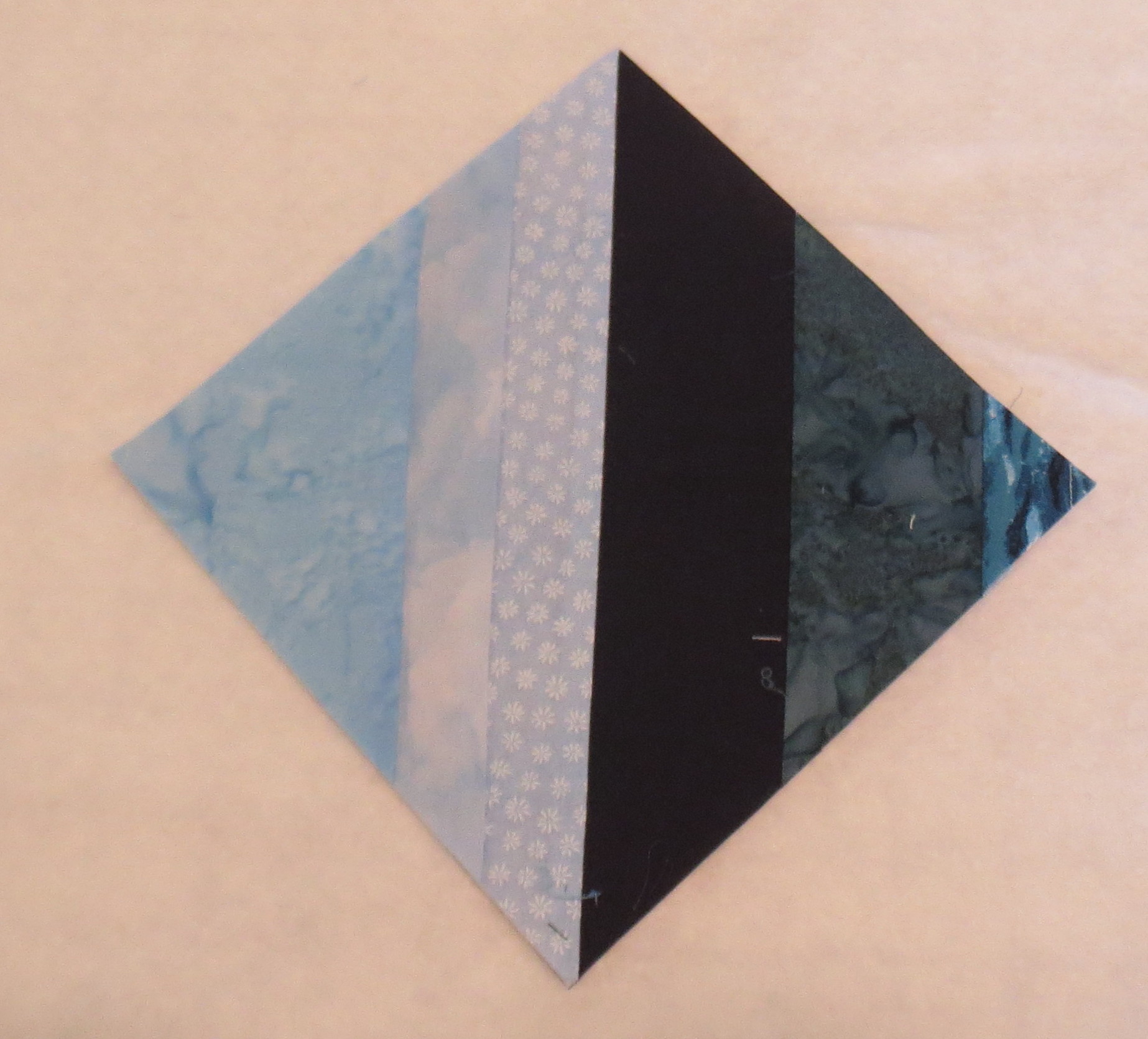
Six inch finished blue diamond block
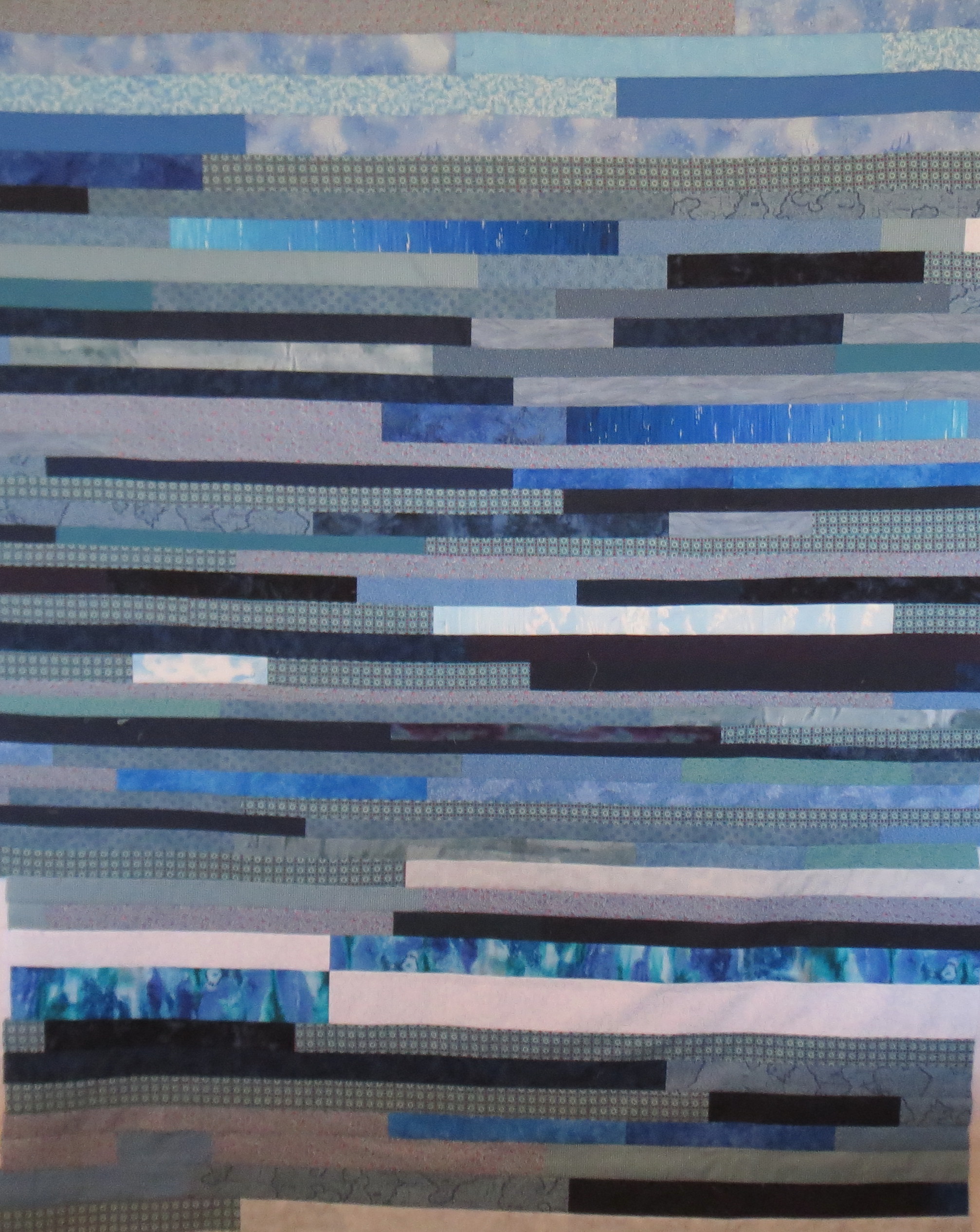
After I had 80 blocks made like this, I arranged them into diamond shapes and sewed together the blocks to make the quilt top below.

Scrappy Blue Diamond, 48 by 60 inches
There were lots of strips left over so I used them to make the quilt back as shown here. I had been careful to stay with a limited blue palette in the blocks so the colors would blend, but I used some stronger blue colors in the back.
Strip pieced back for blue diamond quilt
And here is what is remaining in my blue scrap bin. It doesn’t even look like I made a dent in it! Actually I did, because before I started it was hard to get the top closed. I used up most of the lights but still have plenty of medium and dark blues left.

My blue scraps after finishing the blue scrappy quilts
I think it is time to either get serious about managing my scraps or give them away! More about scrap management in another post coming up — several quilters have developed systems for organizing scraps, and I’m going to investigate them to see if I like one.
In my gallery are photos of several quilts I have made from Zentangle drawings. Zentangle (www.zentangle.com) is a recently invented art form that is a beautiful kind of structured doodling. In its simplest form, practicing zentangle requires nothing more than small squares of good drawing paper (stiff paper is best), a few good drawing pens, and a couple of soft pencils. Pigma pens are recommended but you can use many others such as ultra fine point Sharpie if that is what you have. Just don’t try to use a ball point pen.
These minimal supplies make Zentangle the ultimate portable art form. Put the supplies in an envelope, tuck them in your purse, and you can amuse yourself easily the next time you are stuck waiting for something or someone. The process of doing the drawings is very meditative, so it is a great way to distract yourself when life throws you one of those inevitable challenges that you must slog through.
Here are photos of some of my zentangle drawings. They look very complicated, but they are produced step by step in such an organized way that anyone can achieve success quickly. A lot of zentangle drawings are completely abstract, and that is what I did at first. I would show you those first drawings but I can’t seem to find them right now! For a couple of the ones below, I was experimenting with some more representational elements.

Zentangle Butterfly

Zentangle Abstract
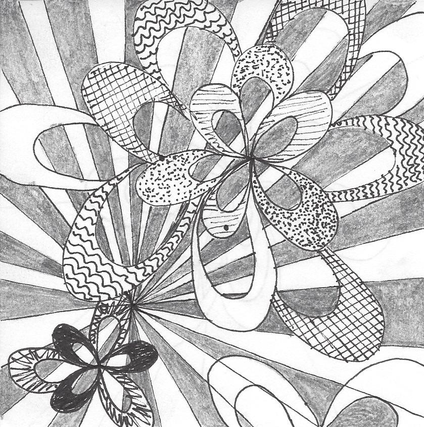
Zentangle ribbon burst wouldn’t this make a cool quilt?
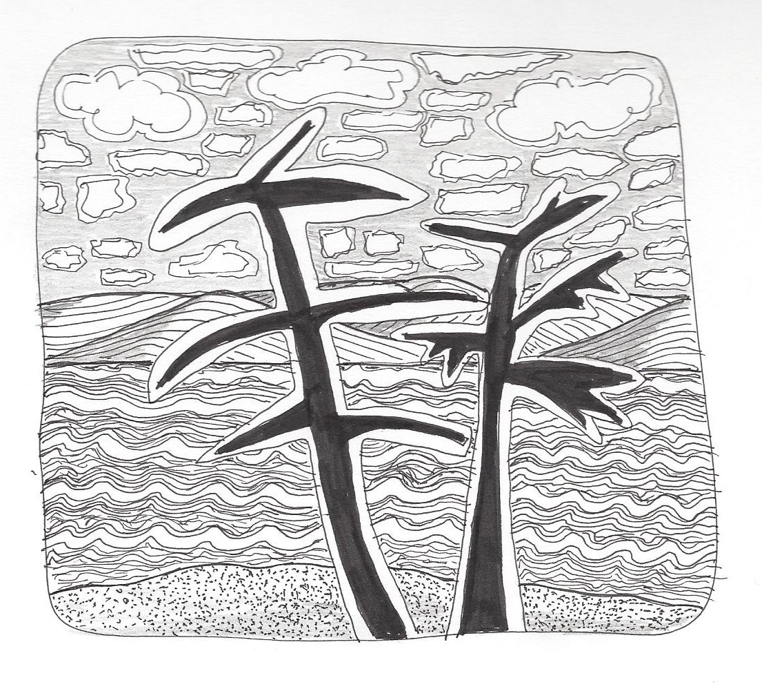
Zentangle trees
There are many Certified Zentangle teachers available to teach you this art (list at http://www.zentangle.com), but there are also books available. As a first book, I recommend “Zentangle Basics” by Suzanne McNeill. Suzanne has written many books about Zentangle; you can find them at your local art supply store or on Amazon. I will put direct links to some of the books at Amazon at the end of this posting.
Once a zentangle drawing is made, it can be turned into a quilt. A great book on this is “Zen Quilting Workbook” by Pat Ferguson. Suzanne McNeil has also a good book called “Inspired by Zentangle – Fabric Arts Quilting Embroidery”. The two photos below are quilts I made from designs in “Zen Quilting Workbook”.

Zentangle quilt pattern from Zen Quilting book

Colored Zentangle quilt, pattern from Zen Quilting
All of these quilts are done by enlarging the design as desired, tracing the design on the fabric with water soluble or iron-away pen, creating a quilt sandwich, and stitching the pattern outlines by free motion. The fine detail lines and solid black areas are filled in with ink. The softer gray shading is done with pencil. Colors can be applied in many ways with paints or inks. Although the basic Zentangle form uses just black, white, and gray, many artists have extended it into various colors. And some lovely drawings and quilts have been done that are white or silver patterns on a black or other dark background.
One day I did an original graphic abstract zentangle design and used it for the pocket on a tote bag:

Zentangle embellished tote bag
Check out my quilt, “Quiltangled Portland” in my gallery. There is also a photo of another quilt there from one of my original abstract zentangles. And here are the links to the Zentangle books I recommend above:
Zentangle Basics by Suzanne McNeil — well, I don’t understand why, but Amazon won’t let me link to this book. They sell the book, I just can’t make a link to it. You can go to Amazon and type in the title and you will be able to order it.
Zen Quilting by Pat Ferguson: Zen Quilting (DO #5375)
Inspired by Zentangle: Fabric Arts Quilting Embroidery by Suzanne McNeil: #5366 Zentangle Fabric Arts
Happy tangling!
I have completed my class, “Working In Series” taught by Elizabeth Barton. It was really interesting to watch the development of quilt series by all the students. As in most online classes, only a few students actually carried through to complete a series. In some instances, this was because the students had selected a complex topic. Those of us who chose simpler abstract shapes — or a small flower, in one instance – were able to finish the process. Students who chose topics such as a series of landscape quilts or quilts based on buildings had much more work to do to develop their series and were not able to finish within the time frame of the class.
I posted earlier about using watercolor pencils for quilt design. Following that exercise, I purchased a small set of tubes of watercolor paint and painted some simple large flowers. We were instructed to use black, white, and gray to make a value study and then paint others in color. I am only going to present the value study here. As you will see, I have no skill at painting!
Here is my black and white value study:

Watercolor value study
Using this value study, I drew a grid on top of the watercolor painting and assigned a “value” to each square. The photo below shows a closeup of the grid and numbers.
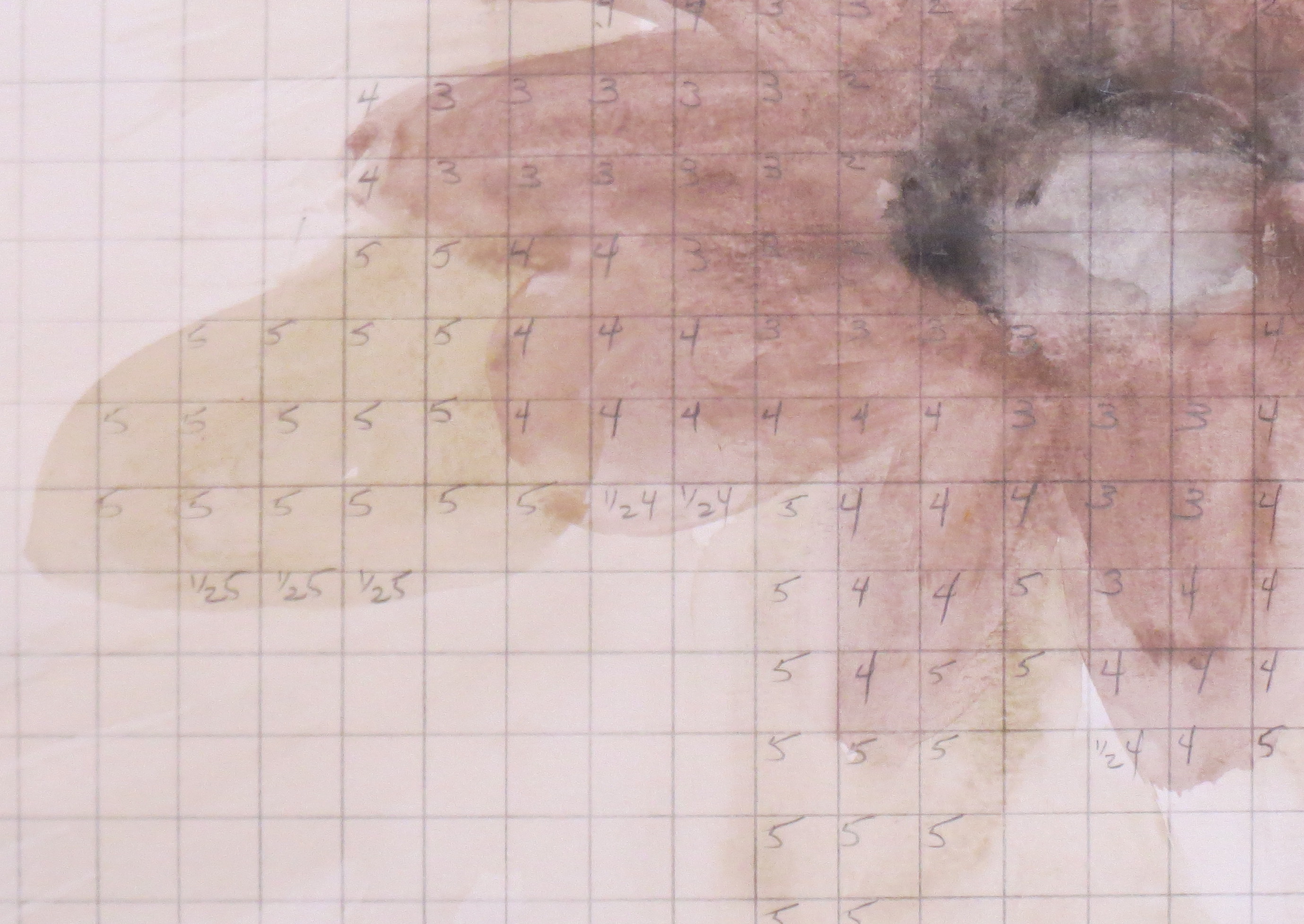
Value grid with numbers
I ended up with seven different value numbers. I grabbed some black and white prints from my stash with a range of values from light to dark, and selected seven of the fabrics. I cut a rectangle from each fabric and put a fusible web on the back. I then cut one inch squares from each fused fabric, keeping the each fabric in a separate numbered pile. A grid was drawn on a piece of white fabric (one inch squares) with an iron-away marker (Frixion pen). The squares of black and white fabrics were placed on the piece of white fabric, matching the numbered squares in the original design. Once all the fabric squares were in position, I ironed the pieces down. The following photo shows the result.

Mosaic quilt from black and white value study
I doubt I will ever turn this into a quilt, but the process is used by some quilters to make spectacular quilts from photographs (such as very large portraits) where the color and value of each small area of a photograph is matched. Once the fabrics are selected, the process is very methodical.
