Sacred Threads has posted a video of the Eye Contact exhibit that was held in July. Here is a link to the video: http://www.sacredthreadsquilts.com/html/iseeyou.html
What a cool way to display these little quilts!

Sacred Threads has posted a video of the Eye Contact exhibit that was held in July. Here is a link to the video: http://www.sacredthreadsquilts.com/html/iseeyou.html
What a cool way to display these little quilts!
A couple of months ago I saw an announcement that the Rocky Mountain Quilt Museum in Golden, Colorado is having a juried show this fall of English Paper Pieced Quilts. The quilts must be at least 75 per cent paper pieced. Since I made such a quilt a few years ago, I read the requirements carefully and convinced myself that my quilt would qualify. I submitted an entry, and last week was delighted to hear that my quilt has been accepted into the show. There is a photo of the quilt in my gallery, but I took a better photo for the submittal, and here it is: “Best Wishes From The Far East”:
This quilt is pretty large – the hexagons are six inches. The Chinese characters are made from Ultrasuede and are machine-appliqued. The quilt is hand quilted.
The quilts will be exhibited in the Museum (located at 200 Violet Street, Suite 140, Golden, CO) from October 21, 2019 to January 18, 2020. There is an opening reception Friday, October 25 from 6-8 pm. I would love to go but it’s a long way; maybe I will think up another reason to be in the area!
And coincidentally, I just finished another English Paper Pieced Quilt with a modern vibe:
Still thinking about what to call this one. It wouldn’t have qualified for the show since it isn’t 75 per cent paper pieced. The fabrics are all Moda Grunge. Hexagons are 3 1/2 inches . The quilting is by machine.
I have just completed an on-demand video course on fused applique portrait quilts. It is taught by Lea McComas (her website is www.leamccomas.com/) and is available through The Quilting Company https://www.quiltingcompany.com/store/courses-videos/courses?technique=249 .
Lea does an excellent job of explaining the process of creating portrait quilts. After explaining how to select a suitable photo, she explains the process of cropping it, transforming it to grayscale, and then “posterizing” it to reduce the number of values in the portrait.
Lea also has fabric and threads available on her website that are already in the range of values she recommends. To avoid having to spend hours in the car going from one quilt shop to another, I purchased these fabrics and threads directly from her. The fabrics she supplies are solid Kona cottons. They are nice fabrics but will result in a particular “look” to the finished product. Sort of like an old “poster” or an Andy Warhol look.
I am quite happy with my first quilt following the process and plan to do a few more using these solid fabrics. After some more experience using solids, I will switch to subtle prints for more texture and a different look.
First step was to select a photo. I picked one that was a formal portrait and cropped it.

Then I converted it to gray scale and “posterized” it to reduce the number of values (fabrics).

I enlarged this using Microsoft Paint (page setup for printing allows you to specify how many pages you want the photo to print on). I could have put the file on a thumb drive and taken it to my local print shop, but it was quicker to do it at home and tape the pages together.
Then I put the image on my light table and put freezer paper on top so I could trace a pattern for cutting out my fabrics:

The little red arrows mean that an extra 1/4 inch or so of fabric should be allowed on that side of the pattern piece, so it can be layered underneath the neighboring piece.
These pieces are then carefully cut out and ironed onto the various fabrics. A fusible such as Steam A Steam 2 Lite or Misty Fuse is then applied to the back of the fabric and the fused pieces cut out. Starting with the lightest value, the fabrics are built up on a muslin backing until the result looks like this:

Then a quilt sandwich is made with this quilt top, batting and a backing fabric. Finally a layer of bridal tulle is placed on top to hold all those little pieces in place! The layers are pinned together and then free motion stitched. The face is stitched by just outlining the fabric pieces. Extra stitching is done in the hair and the background to add some additional texture.
The final result, after quilting and adding a facing is below:
 This is an interesting process! The cutting out and fusing down of the pieces is a little tedious, but overall it is a fairly quick process to create a portrait quilt.
If you are interested in trying this process, be sure to take Lea’s class.
Lea uses a fused quilt like this as a “base” for heavy thread painting. That allows for a much more realistic look in the face, because the thread can be used to soften the color transitions. Check out her website for examples of her spectacular quilts!
I spent a couple of days this week at Sew Expo in Puyallup, Washington. This is a really BIG show with lots of vendors about everything sewing. A wonderful place to see all the new products up close and personal. Many of the sewing and quilting big names come and are in their company’s booths, autographing their books and demonstrating techniques.
All the sewing machine manufacturers come and bring their newest machines. You can get a demonstration or sit down and sew on the machines, take a “make it and take it” class using the machines, or just get all your questions answered about specific issues you may have with your own machine. I always go each year with a shopping list and a list of questions I want answered about whatever I am having trouble with at the moment.
I see that Koala has redesigned their cabinets to accomodate the newer wider sewing machines. The new machines fit in last year’s cabinet, but there wasn’t enough leg room underneath. When you sit lined up in front of the needle of your machine, your left knee can run into the cabinet structure. I am only sorry I bought my cabinet last year before they made the change! I was planning to go complain (politely) about this deficiency, but they have already corrected it. It’s not a fatal flaw, but with my long legs I would have appreciated the extra room.
I will add a couple of posts later showing what I learned in a couple of classes I took, but here are a few items that I found interesting.
First, using a lightweight fusible interfacing to assemble a quilt. This has been used for watercolor quilts (where the quilt is made from a lot of small squares) in the past but would also work well for simple quilts made from squares or rectangles. You can even buy the interfacing with a grid already marked on it. Just lay the squares or rectangles down on the grid, fuse them lightly in place, and then fold and sew on the lines. This year a company from Montana – Crooked Nickel quilts – at http://www.crookednickel.com – showed their variation on this technique using sashing and cornerstones. It looks like a superfast way to make a table runner or quilt. Here is a photo from their booth showing several table runners in various stages of construction on the table, and a completed one hanging on the wall behind. They sell these as patterns or kits on their website. Another one of their features is Tee Shirt quilts, again using a fusible interfacing to back up the shirts. You need an applique pressing sheet so you won’t get your iron all sticky, but otherwise this looks really simple:

A sashed table runner made using fusible interfacing
I was pleased to see one of our local quilters, Barb Schultz, with her Enchanted Valley Arts company booth at the show. Check out her business at http://www.enchantedvalleyarts.com/ . She was super excited about her first time being in Sew Expo and it was great to see her there:

Barb Schultz of Enchanted Valley Arts at Sew Expo
I took one of the “one needle” classes – about 45 minutes long – from Karla Alexander. Karla has terrific techniques for amazing quick quilts. She has just published her ninth book, “Stack, Shuffle, and Slide” and it looks terrific. If I wasn’t in the middle of developing a landscape quilt class and about a dozen other things I would have bought it. Here is a link to buy the book at Amazon: Stack, Shuffle, and Slide: A New Technique for Stack the Deck Quilts . I particularly liked her great technique for creating one of those quilts that look woven, Check out her website for photos: http://www.saginawstreetquilts.com .
Here was another cool idea that would be fun for a kid’s quilt. Not a new idea but still fun. My apologies to the company, I didn’t note the name of the booth:

More from my other classes at the show in the next post: doodle art, and using Tsukineko inks to paint fabrics in really cool ways.
I am working on another quilt with Kamon, or Japanese family crests. These crest designs are quite intricate and are a real challenge to fusible webs. They need a really good adhesive to keep the pieces in shape.
Recently I read about a fusible web I have not used before. It is by June Tailor and is sold in 8 1/2 by 11 inch sheets and can be run through your inkjet printer. The obvious advantage is that, for the right size applique pieces, you can copy or print the shapes right on to the paper back of the web — no tracing of the designs required! The main disadvantage (compared to Steam-A-Seam, for example) is that the adhesive is not “sticky” before ironing. So you can’t stick down all the pieces, repositioning them as needed, and then permanently adhere them by pressing them with a hot iron. I have found that it works better to place one or two pieces and press them with the iron, then go to the next couple of pieces, etc.
I had completed a couple of blocks using Steam A Seam and wasn’t satisfied with the results. The particular fabrics I chose were regular cotton and tended to fray on the edges. One way to solve this problem is to use batiks, which fray much less than regular cottons. But since I am experimenting with these block designs, I just grabbed fabrics from my scrap bins and some of them were not batiks.
Here is the result of the fusing with Steam A Seam. You can see the frayed edges.

frayed edges show with Steam A Seam fusible.
And here is the same block fused with the June Tailor product. The edges are much cleaner.

much less fraying with the June Tailor fusible web
For these intricate designs, I will be using the June Tailor fusible web in the future. It is more expensive than other fusibles, so I will be ordering it from a wholesale source to get the price down. But it can be purchased easily either at your local shops or through Amazon at the following link: June Tailor 8-1/2-Inch by 11-Inch Ink Jet Printable Fusible Web, 6-Pack .
I recently picked up a book “Twelve by Twelve: The International Art Quilt Challenge” about a two year long challenge conducted by twelve art quilters. (Buy it here: Twelve by Twelve: The International Art Quilt Challenge ). The entire challenge was conducted online. A theme was selected by one member, and all the members had two months to produce a 12 inch by 12 inch quilt based on that theme. After the challenge was completed, the members published this book. All the members discuss their thoughts about the challenge and how they arrived at their particular quilt design. It is very interesting reading, and very thought provoking if you want to be an art quilter.
A number of interesting techniques are described in the book. One I found intriguing — and compatible with some of the things I have been doing this year – was a technique described by Terry Grant. She used pastel pencils to add shading to commercial fabrics to get a more realistic result. I just played around with this idea today and can see how it works. According to Terry, after you are satisfied with the result, the shading is made permanent by painting over it with a dilute solution of acrylic textile medium and water. I haven’t tried that part yet, but here is the result from spending 30 minutes or so adding the shading with white, navy blue, and black pencils .


dimensionality added with pencil shading
Interesting! This is much like what I was doing last spring with my sliced circle pieces with crayons and Shiva Paintstiks. At that time I settled on a white Paintstik to get the best white highlight on the spheres. The pencil result here is quite good and much faster, if it will truly be permanent after covering with the textile medium.
I have completed six quilts in my Working In Series class, and will show all of them in this post. The class was very challenging and I recommend it highly for any of you interested in producing more art quilts. Again, the class is taught by Elizabeth Barton through the Academy of Quilting (www.academyofquilting.com) .
Here are the quilts, in the order I completed them.
1. Blue spheres. The background is hand painted. A variety of white on white fabrics were used for the strips. The spheres started with circles in several blue and green fabrics. The shading was produced with a white Paintstik (see earlier post for details).

Blue Spheres
2. Purple circles. Deep purple background fabric, lavender strips (some hand painted), and a variety of purple circles.

Purple on Lavender
3. Purple circles on yellow strips. Half the yellow strips were painted with a diluted brown paint to darken them slightly to add more depth. The background is dark purple. A variety of purple and blue fabrics were used for the circles.

Purple on Yellow Strips
4. Black and white and red. Black background fabric, A variety of black and white prints for the strips. Red-orange circles.
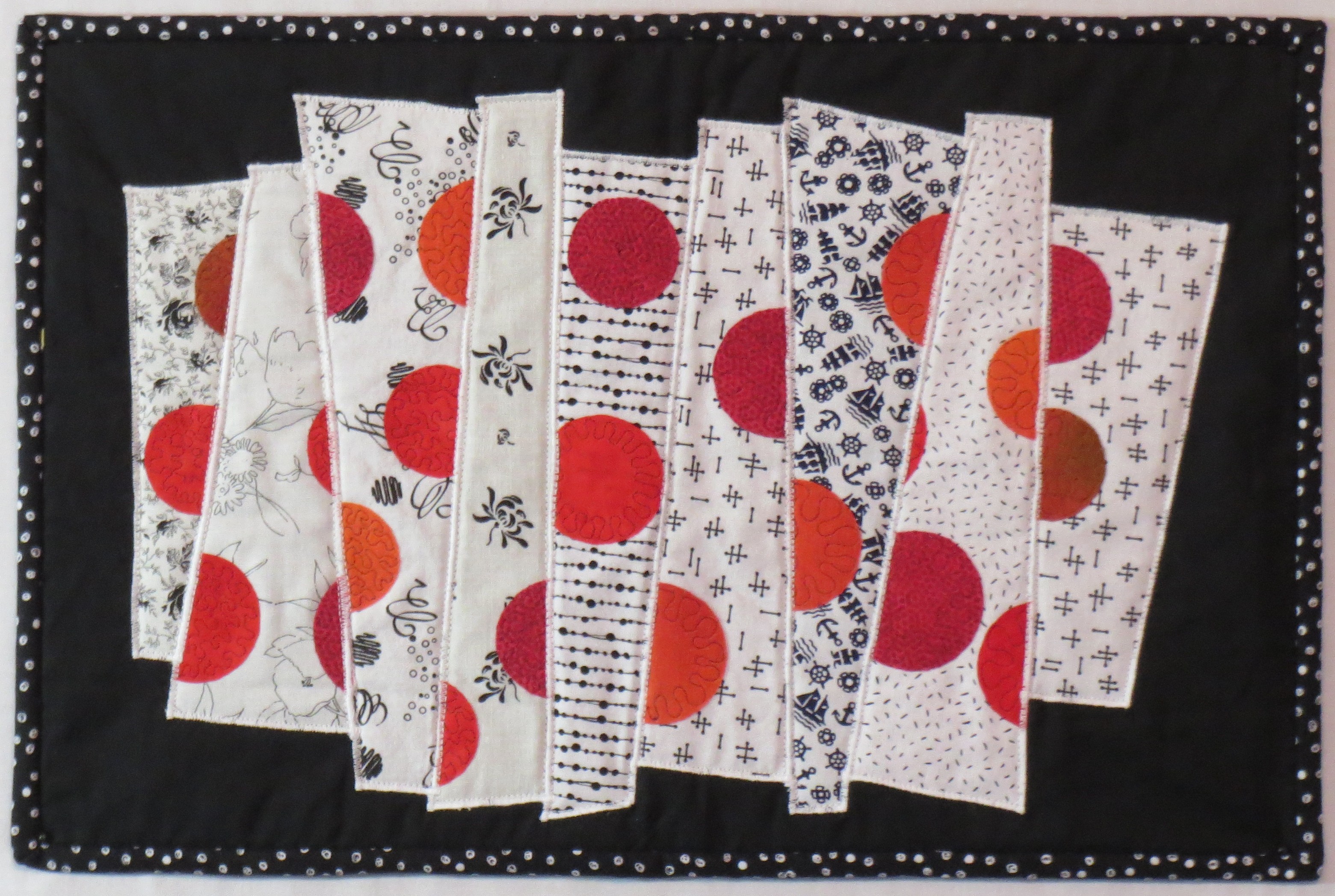
BLack and white strips with orange red circles
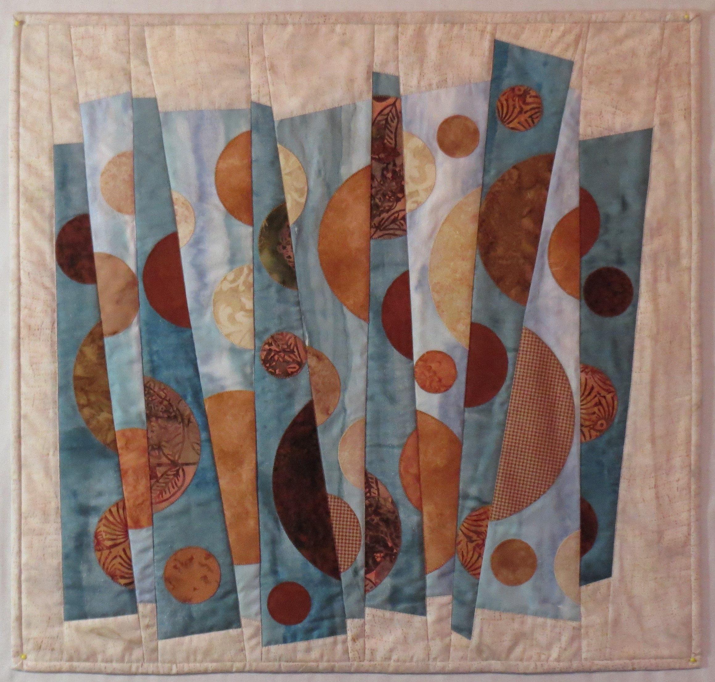
5. Blue, tan, and red. Here circles were cut out of the original circles. I like this idea and want to explore it further.

Blue tan and red
6. Cream, Blue gray and brown. The blue gray strip fabric was a handpainted piece left over from a previous fabric painting class taught by Michelle Scott.
Cream BlueGray and Brown
I can think of many ways to explore this theme further, and look forward to doing so in the future.
Continuing on with my progress in the “Working In Series” class. I did numerous sketches of fractured circles, split circles, etc. I went looking for photographs of circular things, and walked around with my camera taking pictures of circular things. I printed out some shaded circles from my drawing program. I made some very uninspired sketches and mockups. A few seemed promising, but didn’t get me excited.
Finally, I found some photos of some interesting old circular gears by searching online. I printed out the photos and sliced them up, reassembling them into a collage of sorts. I liked the feel of it and decided to pursue the idea. I am not showing my cut and paste mockup here because the original photos are copyright protected. But I will show you where I went from that mockup.
Here is my first mockup, using a watercolor painted background and some shaded spheres printed out from my drawing program:

Sliced blue spheres on white strips
You will see the quilt I made from this mockup in a later posting.
I began working on this quilt (I did an earlier post on how I used paint to shade the spheres) but at the same time I was working on variations of the design. Following are a few sketches that I decided show promise. Some of them ended up as quilts, and others are waiting to be developed further.

Fractured Circle Study 3
Fractured circle study 4

Fractured circle study 10
After these sketches I did some of the designs with turned applique and some with fused raw edge applique. Stay tuned for the finished quilts!
I recently finished a quilt top from a kit that has been sitting around my studio for years. It was a challenging design by Dereck Lockwood that I found intimidating. I just couldn’t stand having it incomplete any longer, so now it is done and ready for quilting. Here is the completed top:
China Blue 77 x 77 inches
I thought the piecing of all those diamonds was going to be the hard part, but I used Sally Collins’ technique of making templates for all the pieces. I punched tiny holes in the templates (see my earlier post about making a circle template for a photo of the hole punch I used) to mark the start and stop points of the seams. Marking all those little tiny diamonds was tedious but not difficult. Careful attention to all the seam allowances resulted in the diamonds being all consistent in size, so the piecing part went pretty well.
The applique was more difficult, because the fabric had a tendency to ravel and the litle flowers all have lots of notches. They just didn’t want to behave! I used freezer paper for the applique patterns and a little fray check where necessary. The result is not perfect but acceptable. I probably wouldn’t select this pattern today, but I am very fond of blue and white so I am pleased with it – except now it has to be quilted! Another big job, but I will plan that another time — hopefully before my guild’s quilt show in September.
In the online class I am taking at the Academy of Quilting, I was puzzling over how to shade some circles to make them look like spheres. One of my fellow students provided a link to a video and suggested I try the “melted crayon” technique. I watched the video and got interested enough to try it. I am going to put some of my results here. At the end of this post I will provide links to the video and to a blog post that provides more details.
This technique doesn’t require any expensive investment. You probably already own most of what you need. I plan to use this technique for art quilts; the resulting color seems to be reasonably permanent but I would run a sample piece through the washer and dryer several times before I used it on a regular quilt.
Here is what you need: your fabric (probably a high thread count white or very light fabric, such as Pimatex) and whatever fusible web you normally use; an applique pressing sheet – one intended for use when you are building up a multiple-piece fusible applique (the fusible is ironed down to this sheet, but can then be peeled up and ironed permanently onto fabric); a box of crayons; some paper napkins; a roll of paper towels for cleanup; and a hot dry iron. If you are not familiar with applique pressing sheets, you may find one at your local quilt or craft store or here is a link where you can buy one on Amazon: Bear Thread Applique Pressing Sheet . This is a link to the smaller, less expensive one (About $12). There is also a bigger one for about twice as much, and there are other brands as well. This just happens to be the brand I have and it works well for me.
Here is the process, briefly. You draw whatever shape you intend to use for the applique on the paper side of the fusible web. Then apply the fusible web to the wrong side of your fabric following the manufacturer’s directions. Cut out the applique shape. Press the applique shape onto the applique pressing sheet. You then use the iron to get the applique shape AND the applique pressing sheet very hot. You grab a crayon and rub it on the hot pressing sheet. This makes a little “puddle” of color. You then pick up the color with the tip of a folded paper napkin and transfer it to your applique shape. Like magic, you have “painted” your applique. I am not going to provide more detail about the process because the links I am providing below give you all that.
Here are a couple of photos of the spheres I painted using this technique.

Spheres colored with melted crayons – first try
And I tried again the next day and found I was more comfortable with the technique, and was able to do it more quickly and got slightly better results:

Spheres colored with melted crayons – second try
After completing the coloring, I placed a paper towel over top of the shapes and ironed them to remove any residual color. Then I washed them in hot soapy water; none of the color came out. As always, your results may be different so be sure to run your own test and make sure this process is suitable for your particular project.
I also tried a couple of other techniques for coloring the spheres. When I was colored white fabric as shown above, I got the best results with the crayon technique. For colored or dark fabrics, I got better results using Shiva Paintstiks (opaque solid oil paints).
I tried some liquid fabric paints also but didn’t get very good results. I suspect that has more to do with my lack of skill than with the products.
I recently did a project using the Shiva Paintstiks and will be putting up a post about that project next week. Lots of details and step by step photos in that post, so I am not going to say much else about it here.
The melted crayon technique has some nice advantages. You can have a full range of colors for the modest price of a big box of crayons. A small project can be completed quickly with little cleanup since the color is applied with paper – so no brushes to clean. A second or third color can be layered on top of the first one immediately. The color is dry right away – no waiting until the next day or several days for the paint to dry.
Here is the link to the video for any of you who are interested: https://www.youtube.com/watch?v=VJN41E2Akto .
My friend Charlie, who also took the class, provided a link to a blog post by another quilter, with great photos and useful information about the technique. I have tried to put the link here, but for unknown reasons it won’t work. I don’t know why I can get to the link from my email or from a google search, but not when I post it here. So I can only suggest you also do a google search for “Quilt Whimsy blogspot melted crayons” and it should come right up. I found it helpful to read this blog post after watching the video; it sort of reinforced the details and I could study the photos more carefully to make sure I understood the process. The video and blog show using this technique on an apple and a leaf, and used multiple colors to get a very realistic look. Terrie Kygar, who did the video, also has written a book about the technique, available through Amazon here: Creative Quilts from Your Crayon Box: Melt-n-Blend Meets Fusible Applique
