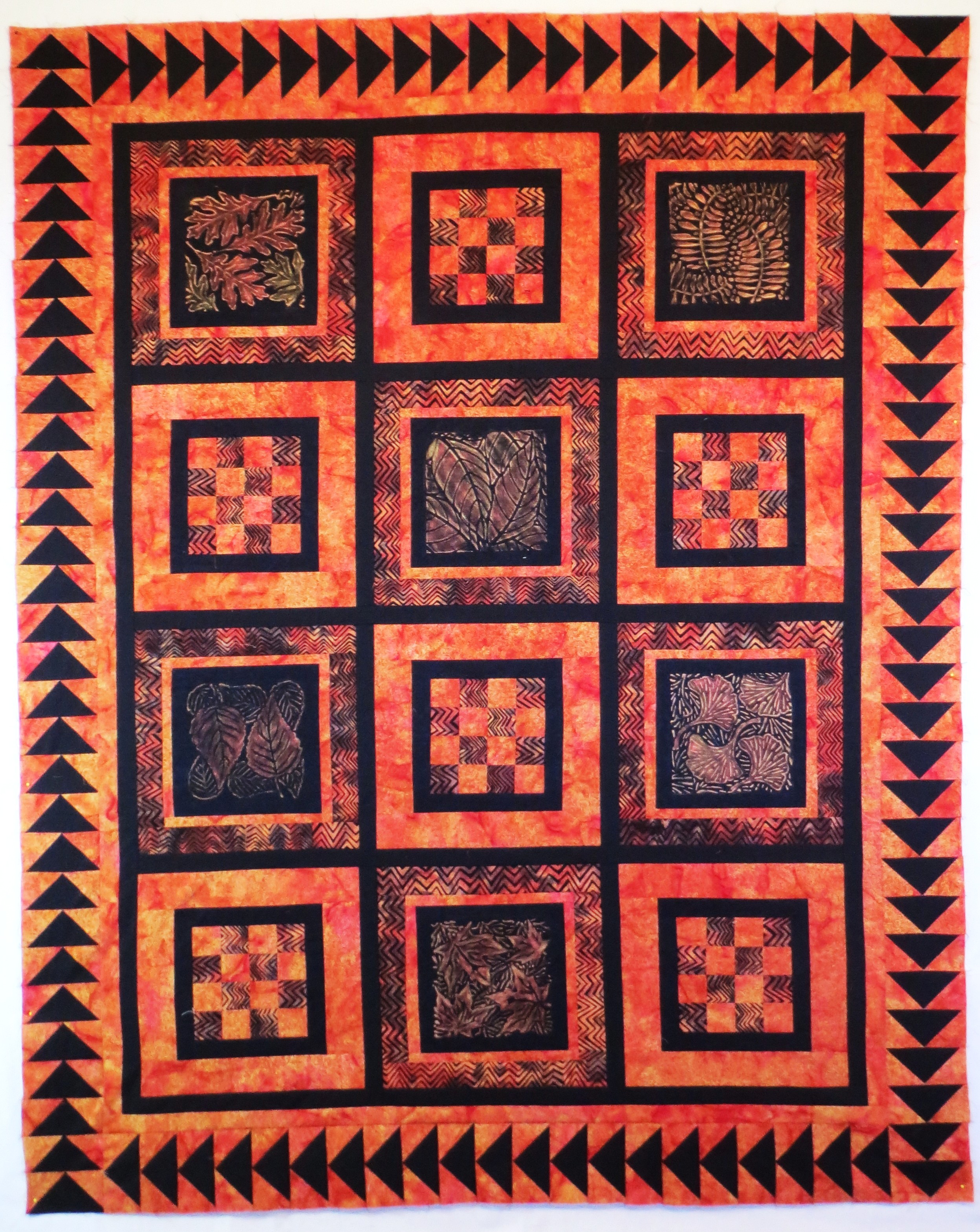
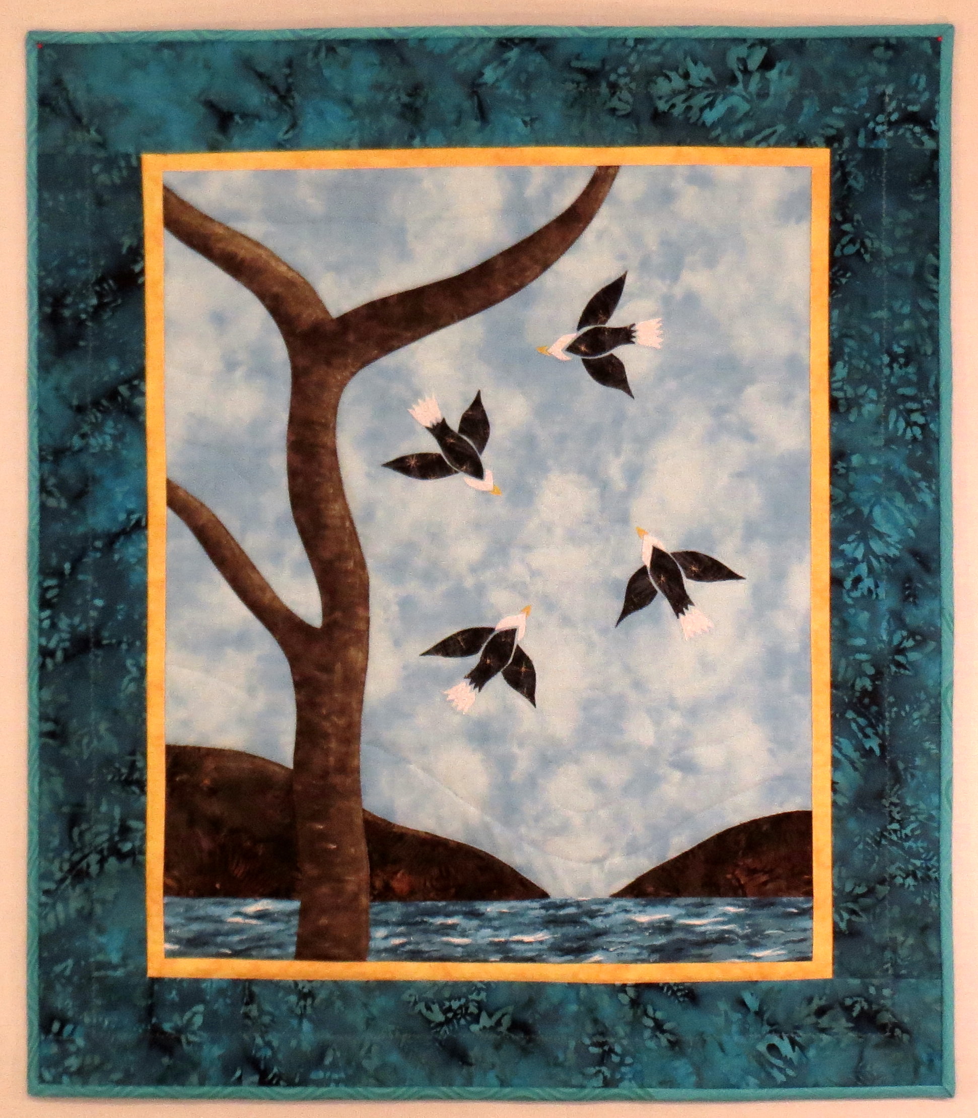
I love many things about Japanese design. One of the aspects of Japanese design that has always intrigued me are the many variations of Japanese family crests, and I have been intending to make a quilt using the designs for at least a couple of decades. Now I am finally doing it. This is a progress report of the pattern drafting process.
On a trip to Japan at least 30 years ago, I purchased a book entitled “”The Elements of Japanese Design – A Handbook of Family Crests, Heraldry & Symbolism” by John W. Dower. My copy of the book was published in 1971, but I also see a 1990 edition for sale on Amazon now. I have made a few failed attempts to use the designs in the past, but was stopped by the difficulty of the drafting process. Here is how I have finally solved that problem – and now I wonder why I didn’t do this many years ago. I think it was mostly because I lacked the confidence to enlarge the designs. I am pleased with the results so I am going to describe the simple process I used.
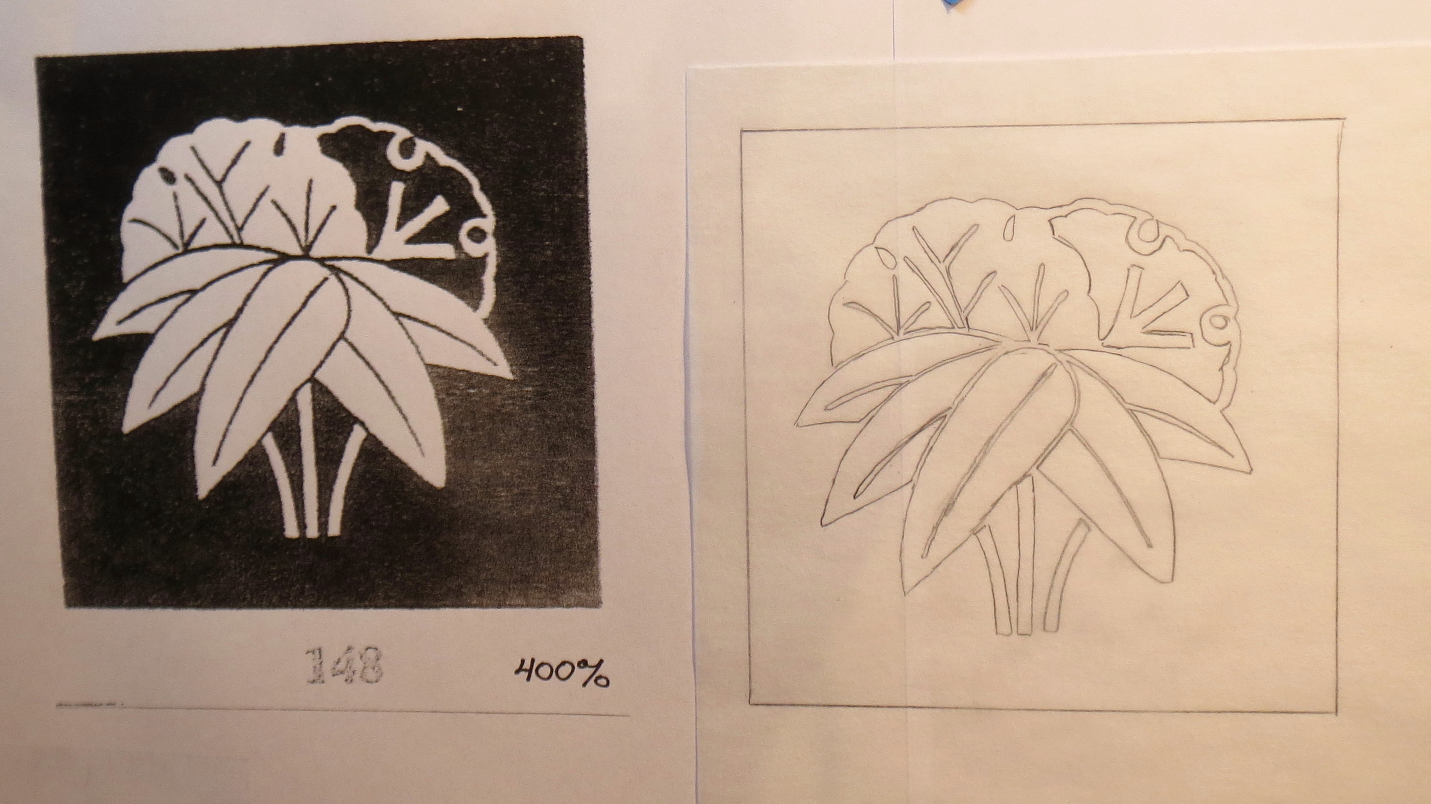
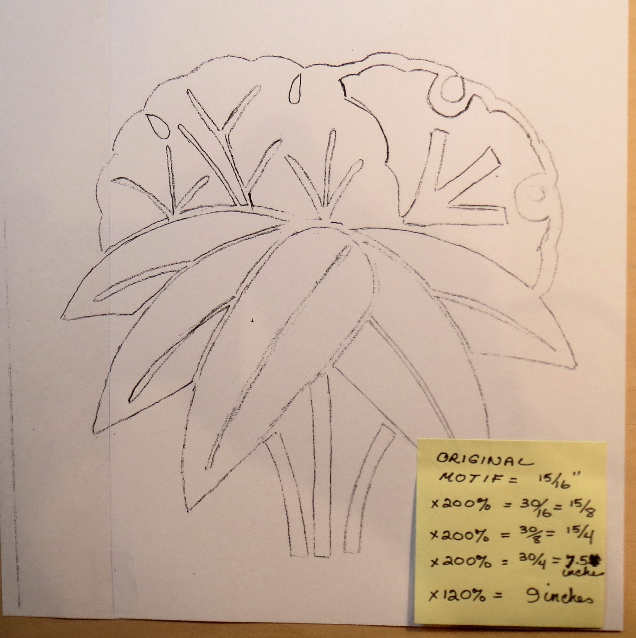
The source of my problem was that the pictures in the book are so tiny. Each kamon drawing is about 15/16 inch in diameter. How to turn that into a 9 inch design for a quilt block? The first photo below shows a page from the book with 25 different kamon, and the enlarged drawings that increased the size to about 3 1/2 inches. I had to enlarge it twice using my copier, since my copier is limited to a maximum enlargement of 200 % at a time.

Using a copier to enlarge the drawing
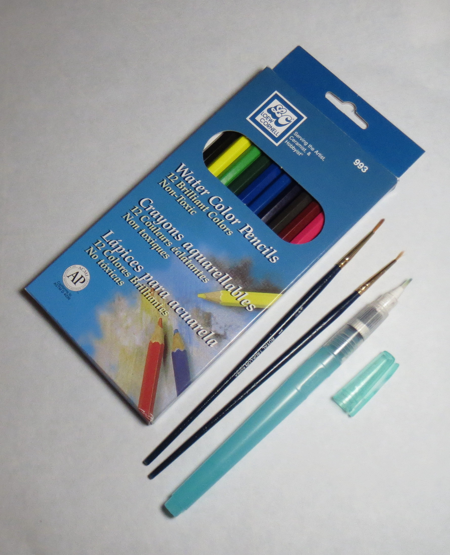
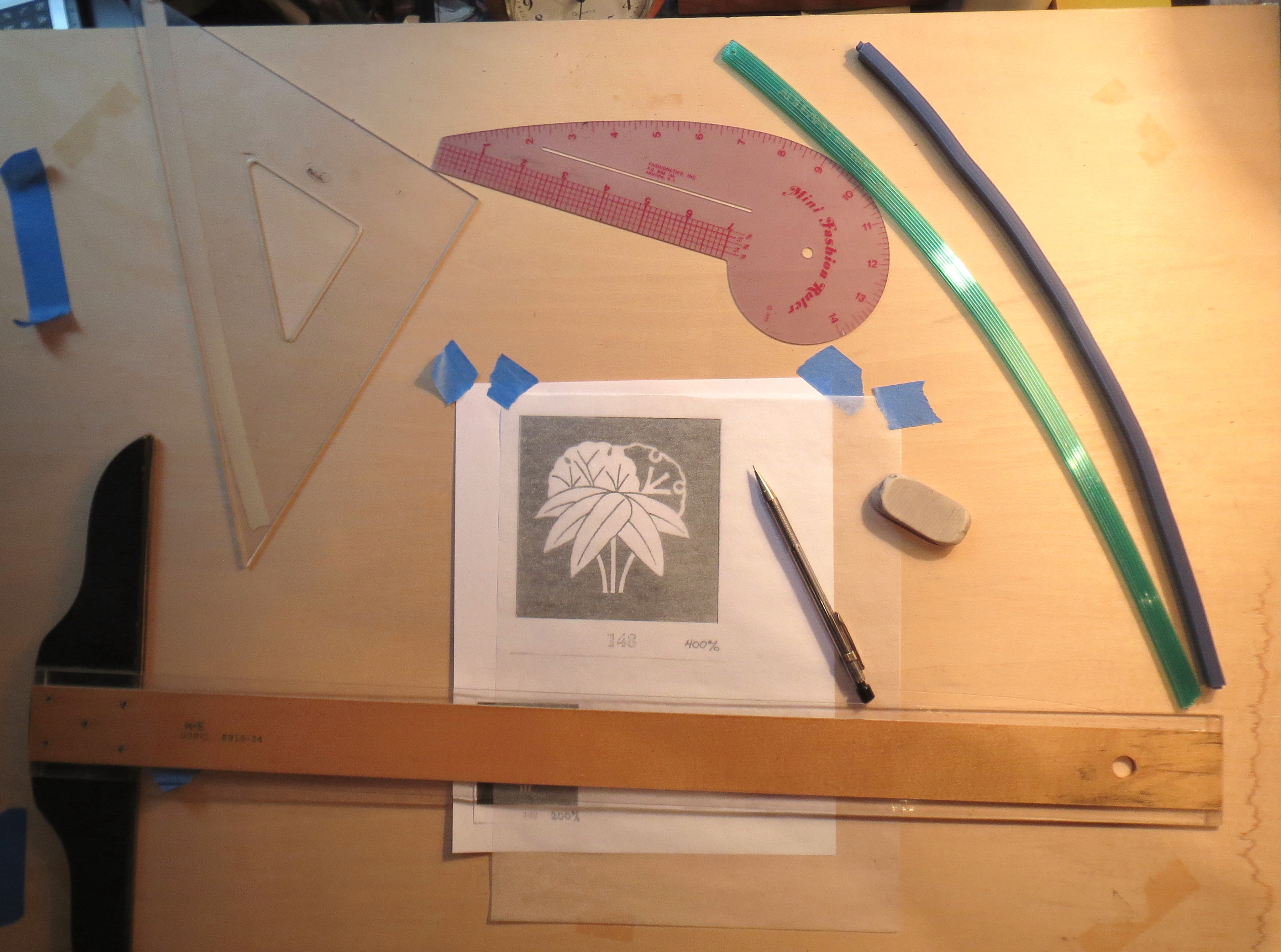
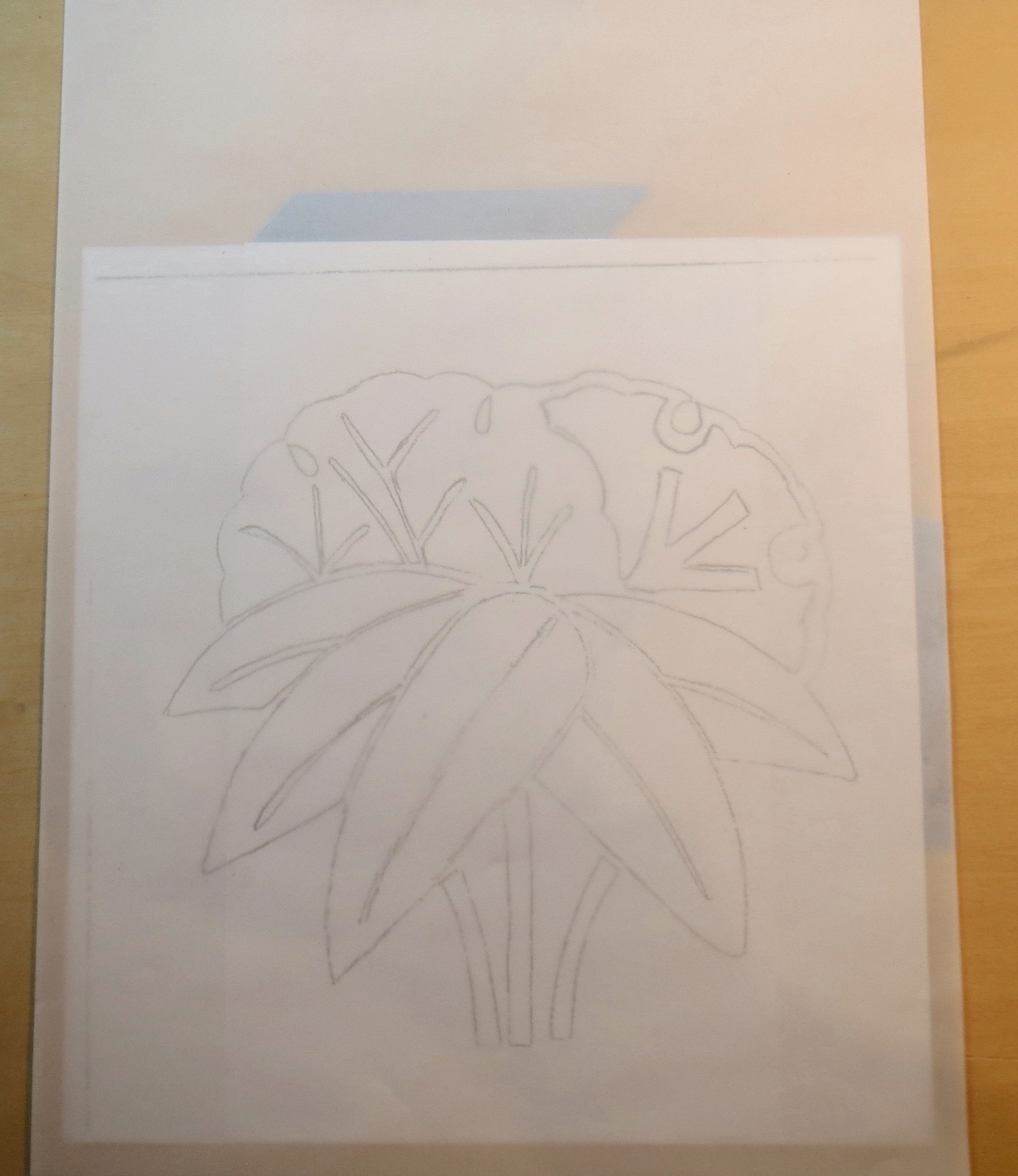
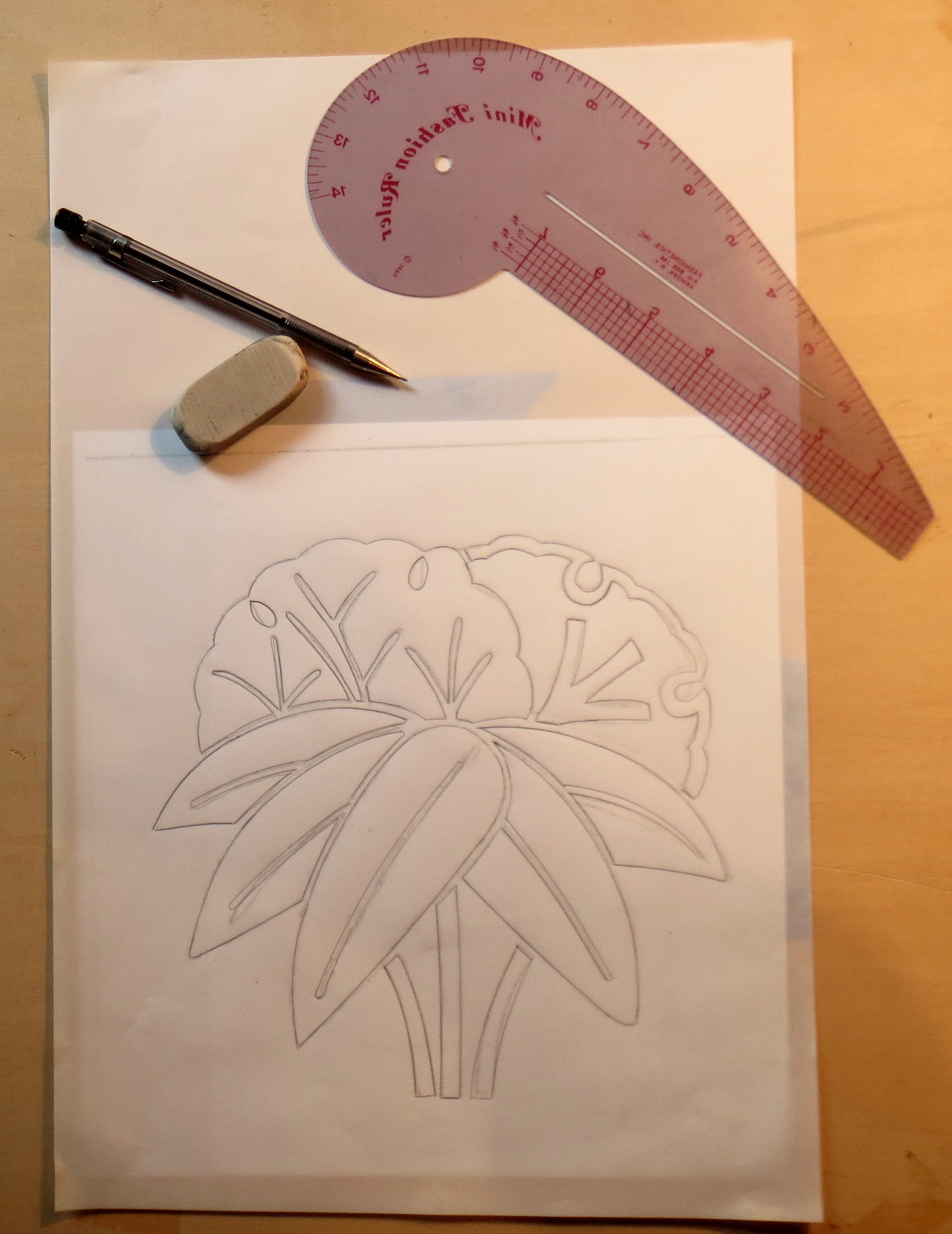
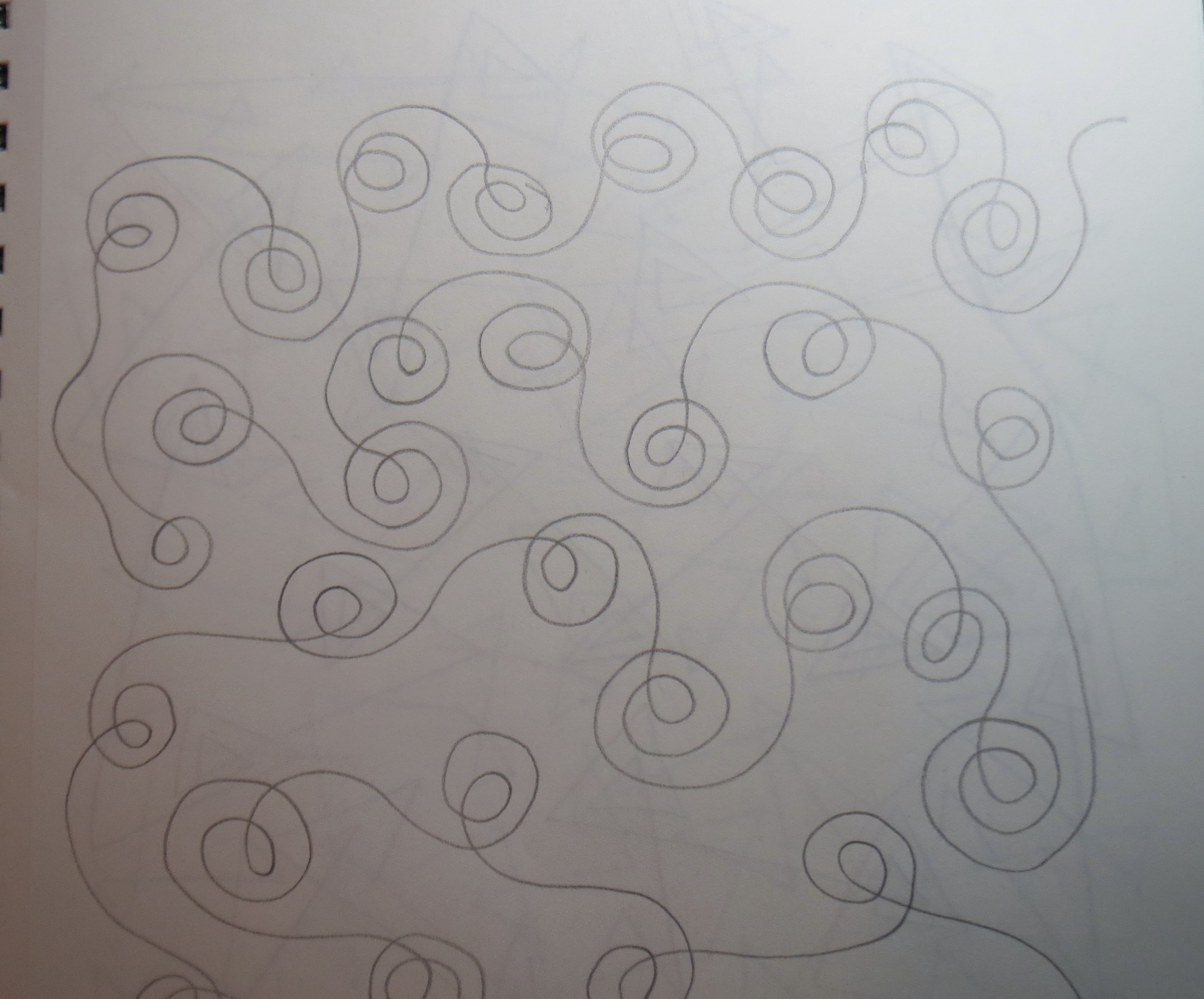
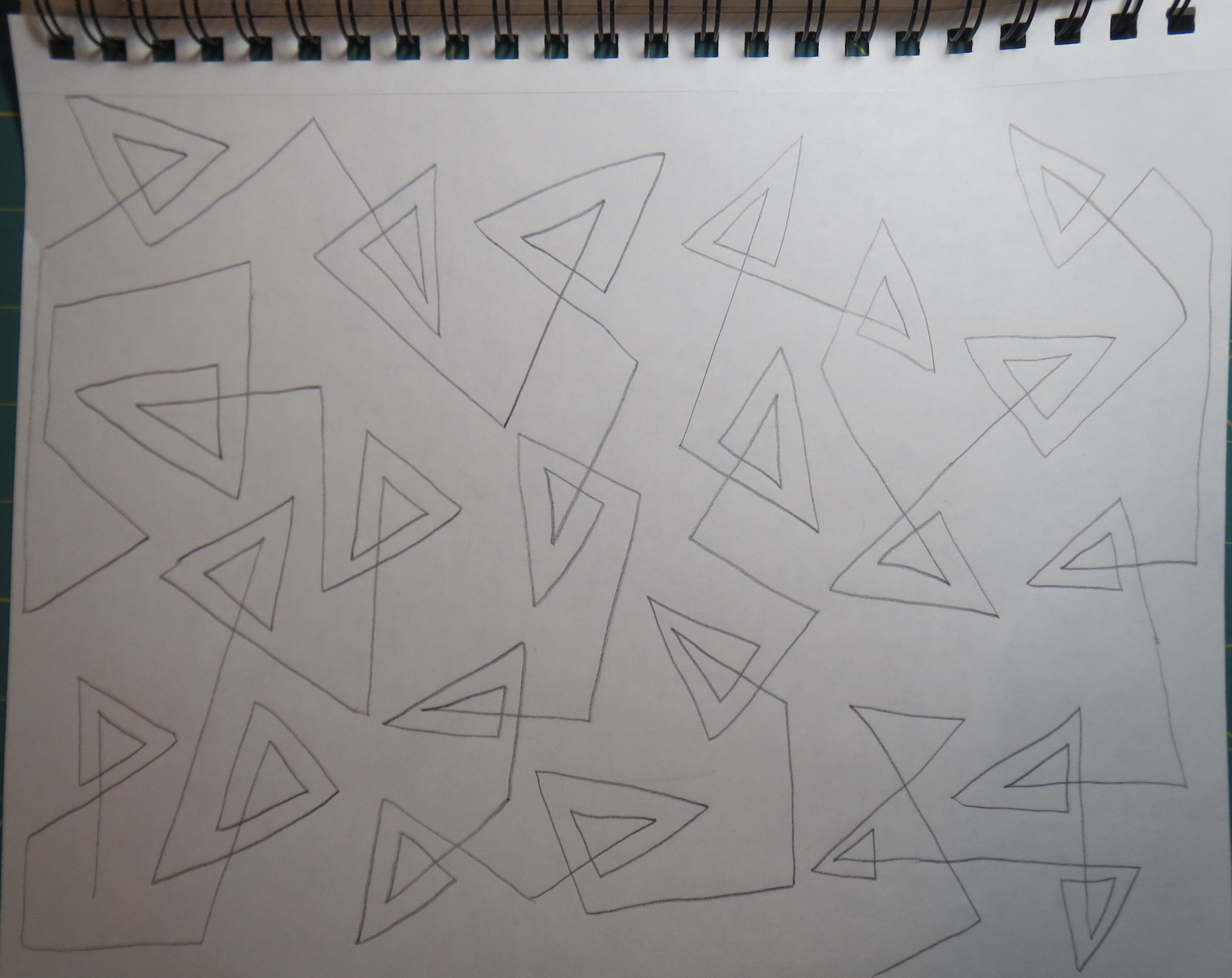
Next I put tracing paper over the top of the design and traced the shapes, as shown in the next photo. I did the tracing at this step primarily to switch the design from white on black to black on white, so I wouldn’t waste so much ink. This tracing was done with pencil (a good mechanical pencil is best). No point in getting very precise at this stage, so I did the drawing freehand. Be sure you have a good eraser on hand – I like the white ones because they don’t seem to leave a residue and they don’t get hard over time. The three different kinds of curves in the upper right of the photo can be used to get smoother curved lines; I used them later on the final drawing.

Tools needed for tracing the pattern.
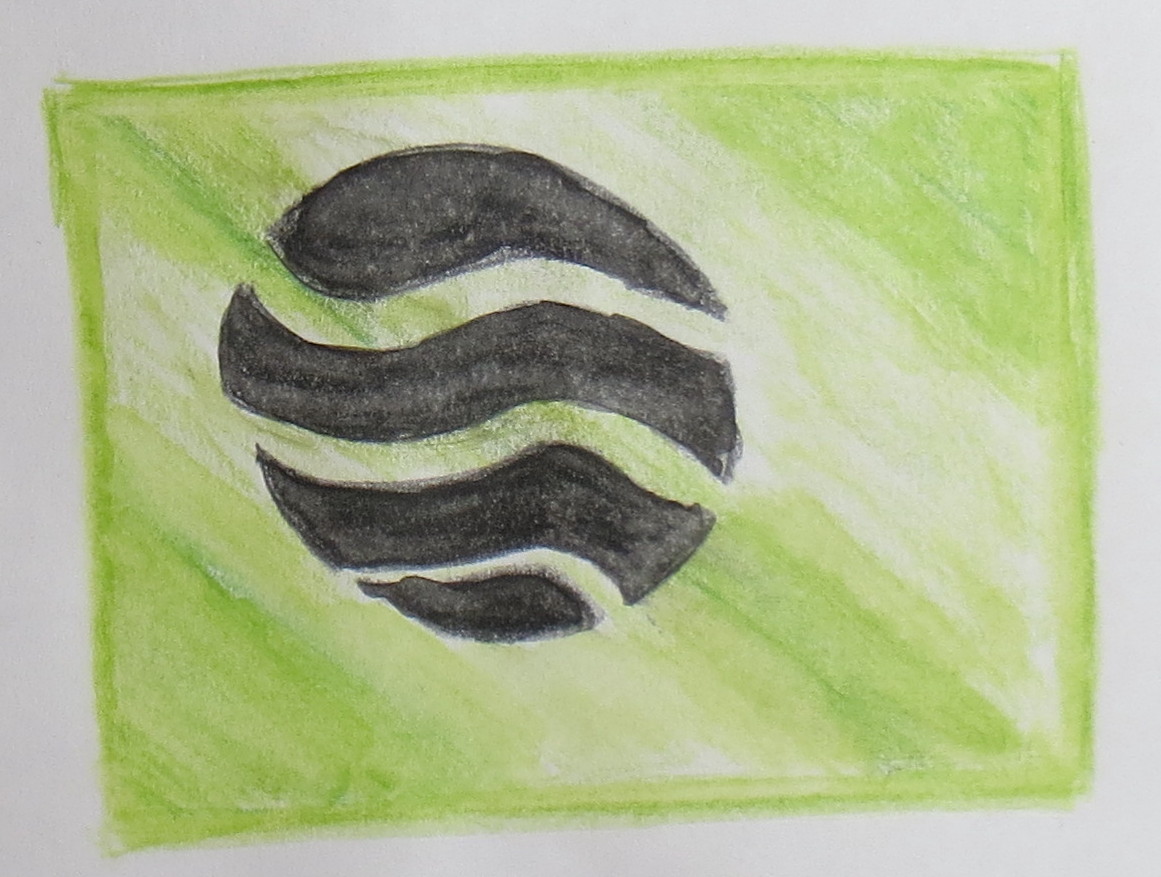
The traced design is shown below.

- The traced design, 3 1/2 inch size
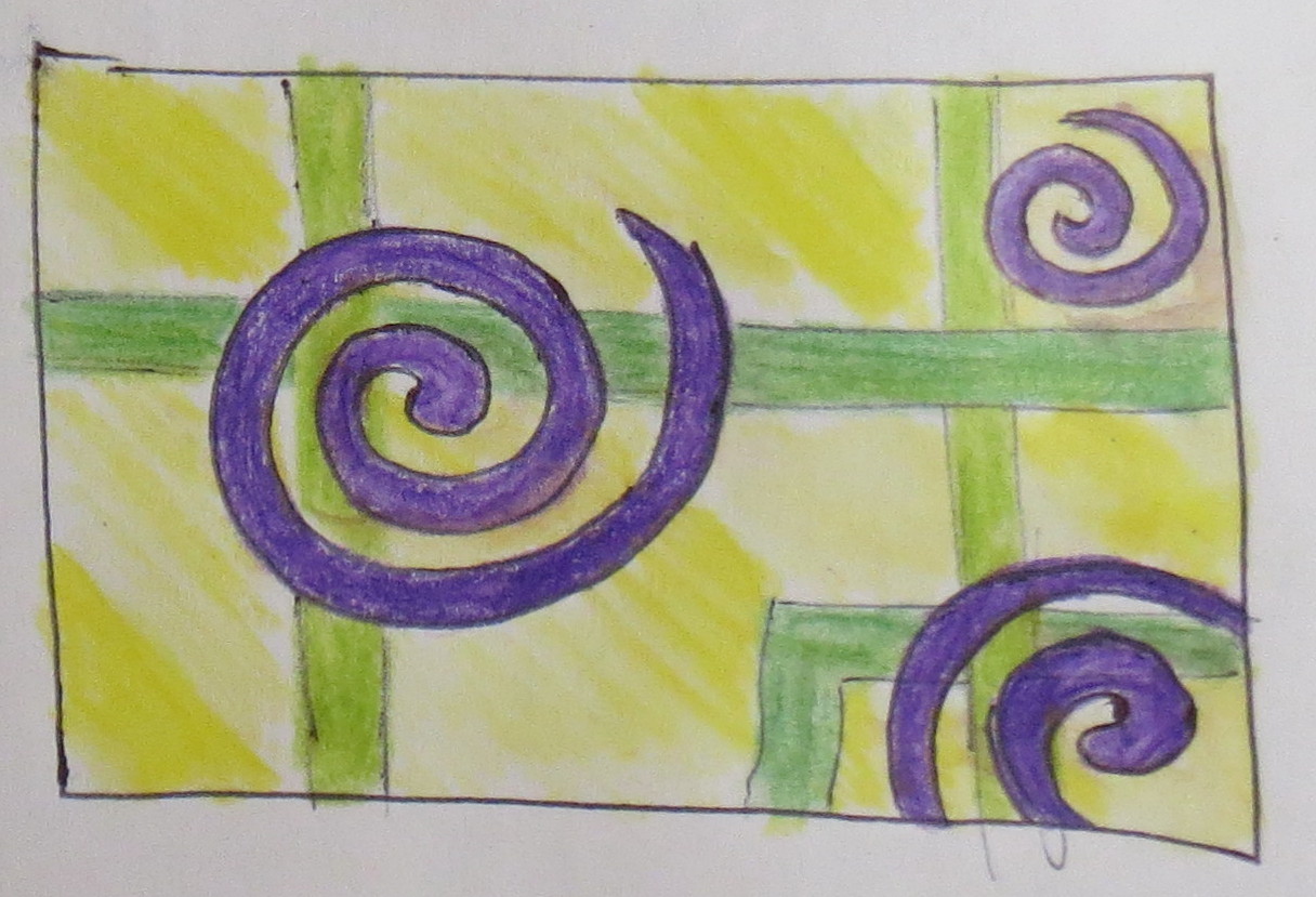
Once the tracing was complete, I put it back into the copier and enlarged it another 200%. A few of the lines were faint and had to be darkened. The design was now 7 1/2 inches across. The final enlargement was at 120%, to get a 9 inch diameter design. Since I only have 8 1/2 inch wide paper, I had to copy the design in two pieces and tape them together as shown in the photo.

The full sized free hand design
Now I am ready to produce a finished design. I placed vellum on top of the copied design. Vellum is a higher quality drafting paper. It is still transparent but can stand up to more drawing and erasing than tracing paper. I actually taped the copied design to the back of a sheet of 11 x 17 inch vellum, using blue painter’s tape. The reason I did this is because it is much easier to draw a smooth curved line if you can rest part of your palm on the table while you draw the curve. This requires moving the paper frequently to get the curve oriented right relative to your hand, so taping the vellum and drawing to the drawing board doesn’t work very well. The photo below shows the vellum with the design underneath.

vellum taped on top of the full sized free hand drawing
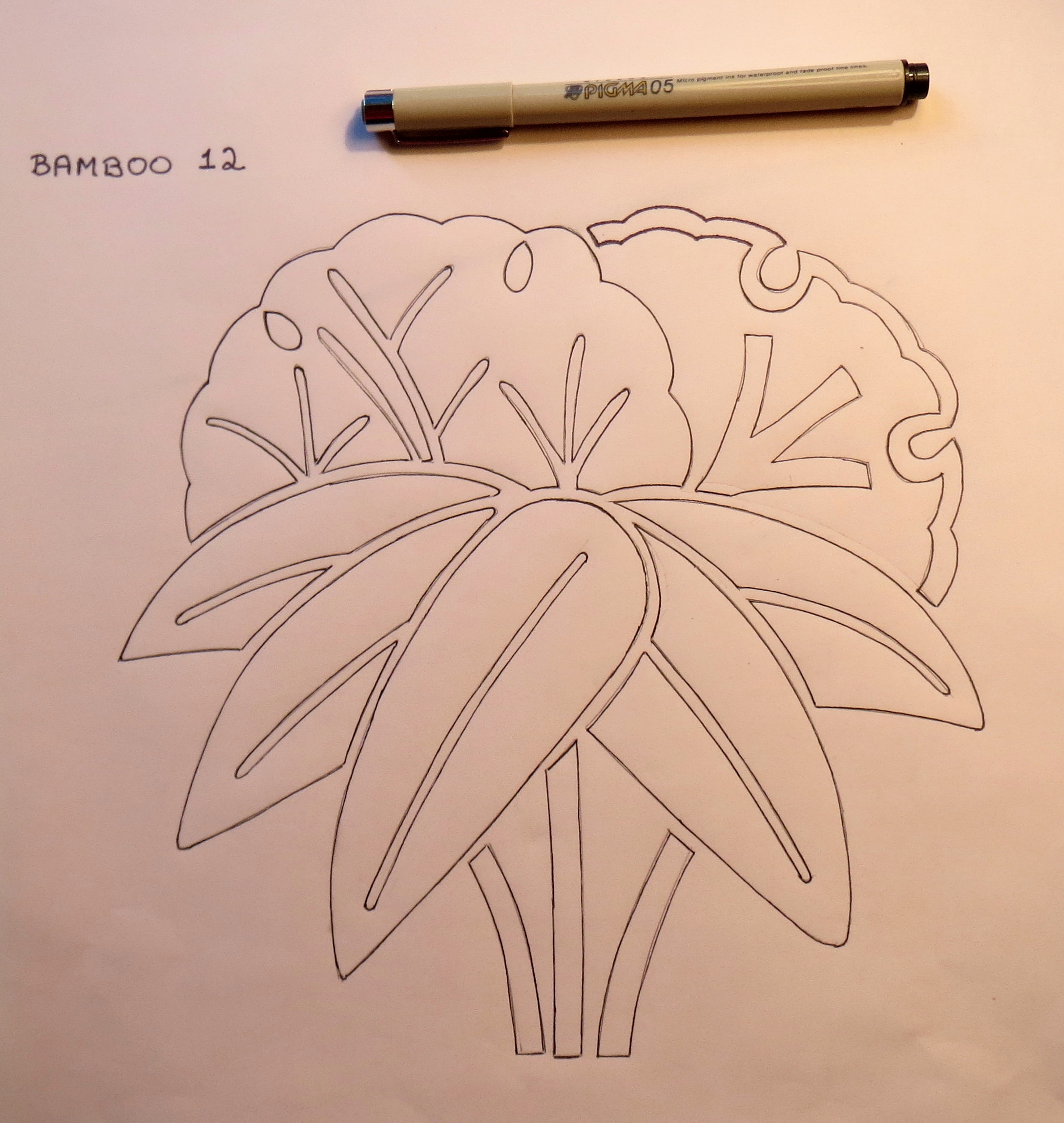
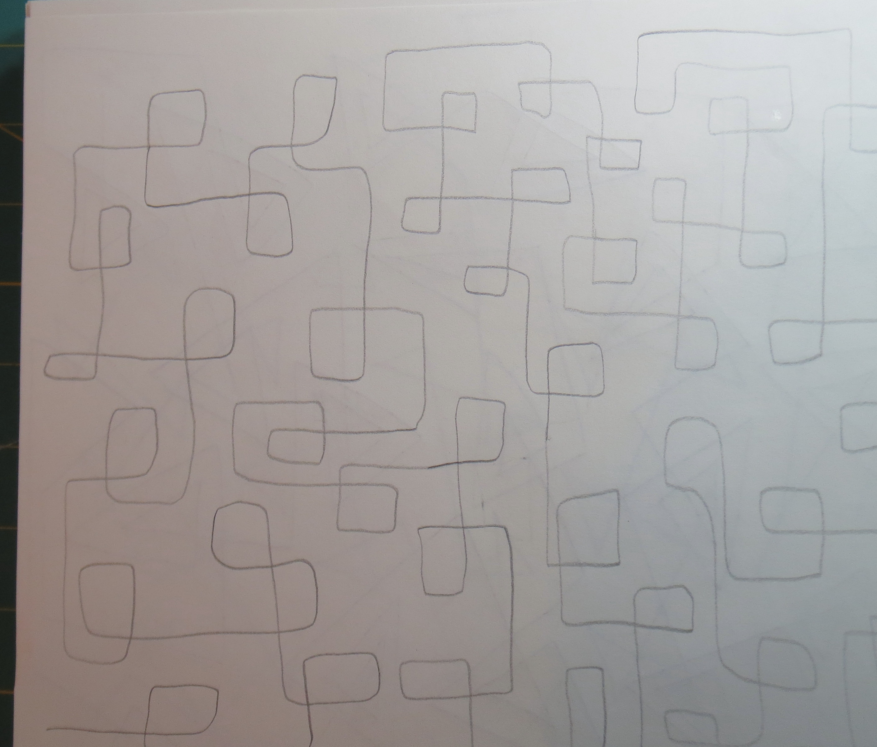
Using a mechanical pencil and a curved template where necessary, I traced the design carefully. At this stage I modified the design slightly to get large enough pieces for applique, to get the spacing between pieces consistent, and to simplify the design where I could. Not much was required for this particular design – some of the others I have done needed more modification. So the photo below shows the completed pencil drawing.

the finished pencil drawing
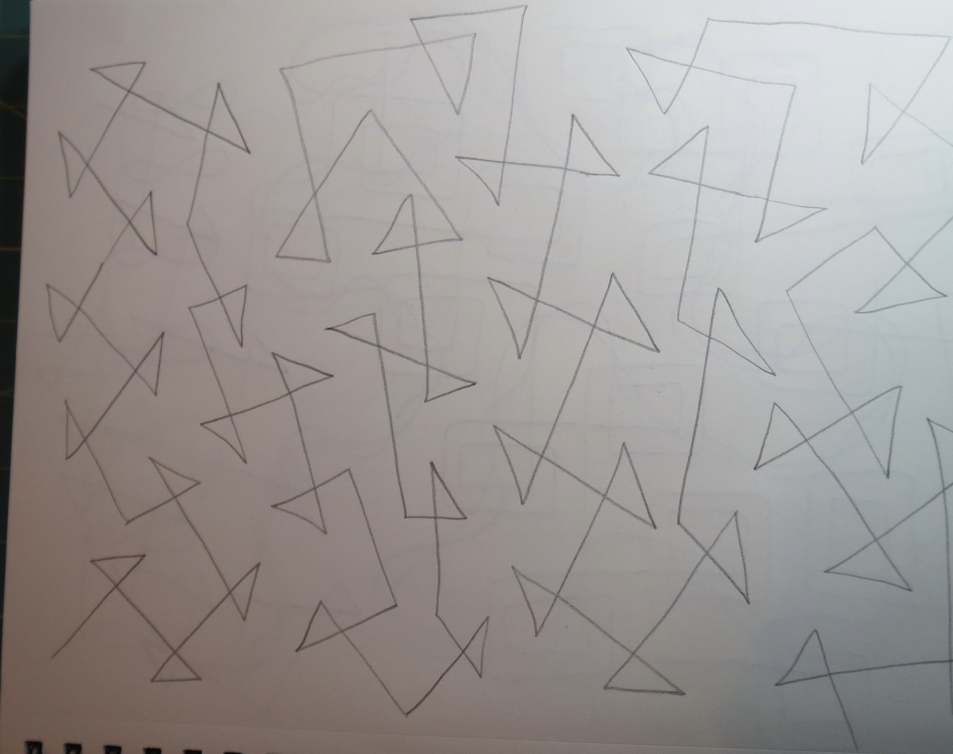
Although I could proceed using only a pencil drawing, I wanted a sharper (and permanent) design that would show through the vellum (since the fusible web I am using requires me to draw the pattern pieces in reverse). So I used a .05 black Sakura pigma pen to draw the lines again. The resulting ink drawing is shown below. I numbered the pattern and also labeled the reverse side so I wouldn’t get confused.

the inked drawing
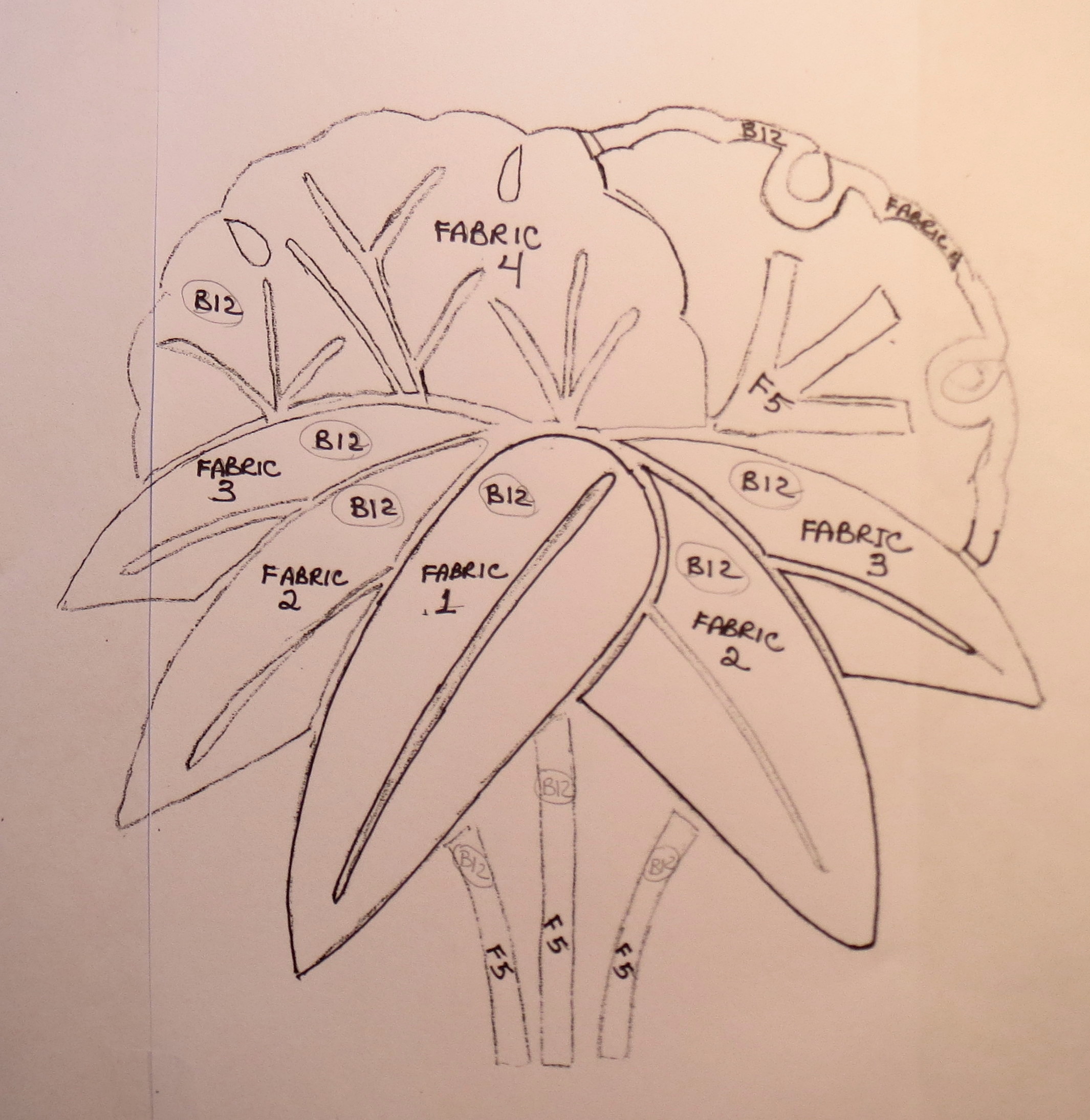
Each pattern piece should be labeled with the pattern and the fabric to be used. For this design, the pieces are labeled “B12” because this is the 12th bamboo pattern I have drawn. I chose which pieces would be made from one fabric, and then labeled them 2a, 2b, etc where the number is the fabric number and each piece using that fabric is separately identified with a letter. As shown below for this pattern, I wrote these labels on the original pattern copy before the final drafting and used that as a reference as I traced the applique pieces.

- the drawing with pieces labelled
Then I placed the design right side down on my light table (which is a piece of plexiglass held up by some wood 2×4 scraps). I slide an Ott light underneath, which has to be moved around a bit to light up the part of the design I am working on. Then I placed some Steam A Seam 2 on top, making sure the adhesive was fastened to the paper side that I am tracing on. I drew all the pieces that will be made from the same fabric together and transferred the pattern, fabric, and piece numbers to each piece. The pieces for this block pattern are shown below.

pattern pieces transferred to the fusible web
I cut the fusible web in sections to keep all the pieces using one fabric together.
The unmarked paper is then peeled off and the tacky side placed on the wrong side of the chosen fabric. The Steam A Seam and the fabric are cut on the outside lines of each pattern piece, using very sharp fine scissors.
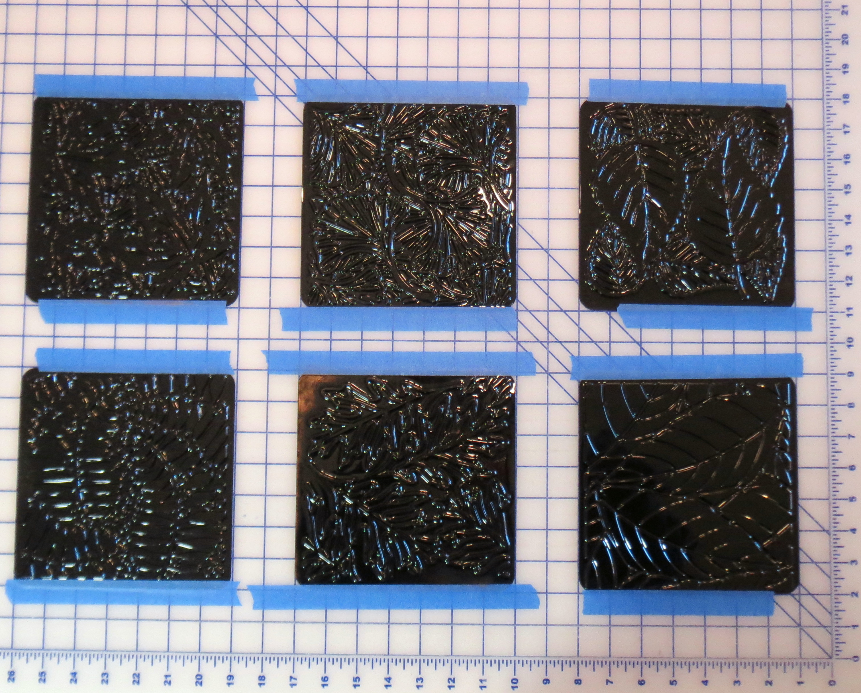
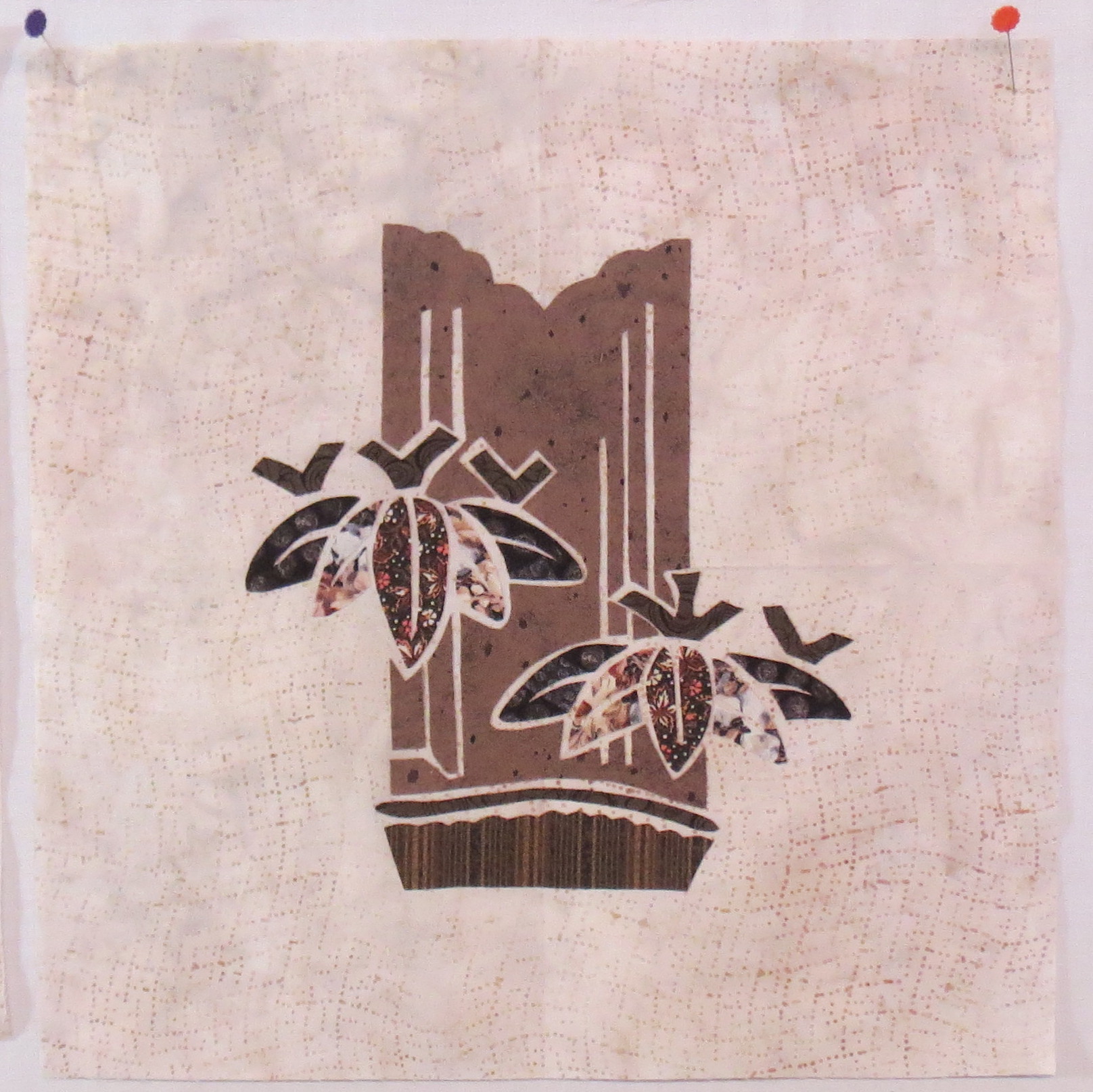
The overall block pattern is replaced back on the light table with the right side up this time. The background fabric for the block is placed on top and centered. The paper is peeled off a each applique piece just before it is put into position on the background. Once all the pieces are in place, the block is carried to the ironing board and fused in place following the manufacturer’s directions. The photos below show a couple of my fused blocks.

Fused bamboo kamon block

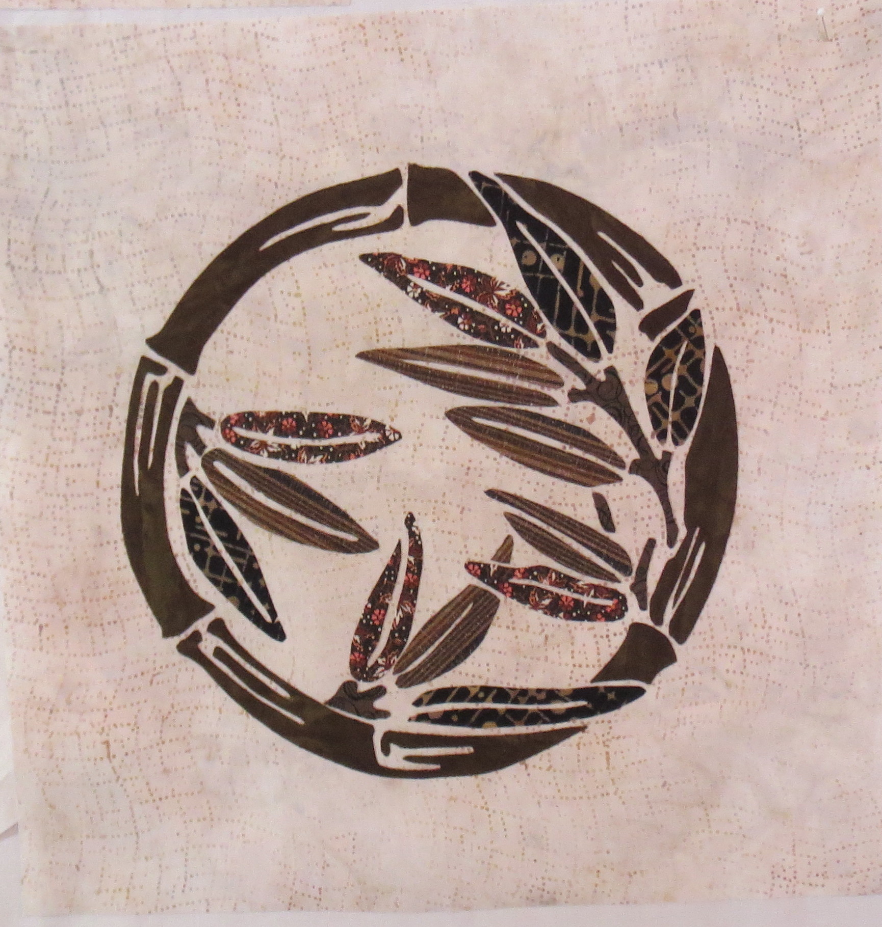
second fused bamboo kamon block
Still lots to be done, but I like the look of these blocks. I have fused the six light background blocks. The remaining blocks for this quilt will have a dark background. The fabric is backordered so I am hoping it will arrive shortly and I can complete the remaining blocks. In the meantime I can stitch down the edges of the applique on the first six.