Category Archives: Art Quilts

Rainbow Scrap Quilt

I received a quilt book as a Christmas gift that I am enjoying.  It is called “Lovely Landscape Quilts” by Cathy Geier and can be purchased either at your local quilt shop or at Amazon through this link: Lovely Landscape Quilts: Using Strings and Scraps to Piece and Applique Scenic Quilts .

This book presents some very simple techniques for creating impressive landscape quilts.  The techniques produce results that will be satisfying to an experienced quilter, but at the same time are simple enough for a confident beginner.  I like the techniques enough that I am considering creating a new class based on this book.  First I have to make a few quilts so I am sure I can get good results and be confident that my students will also get good results.  I started with a very simple quilt using scraps.

Before describing the landscape techniques she uses in the book, Cathy Geier presents a range of landscape quilts by other artists.  The very first artist presented is Ann Brauer.  If you are interested in Ann’s quilts, she has an Etsy store where she sells her quilts and smaller items.   She may also have a website or blog, but I haven’t looked for those.

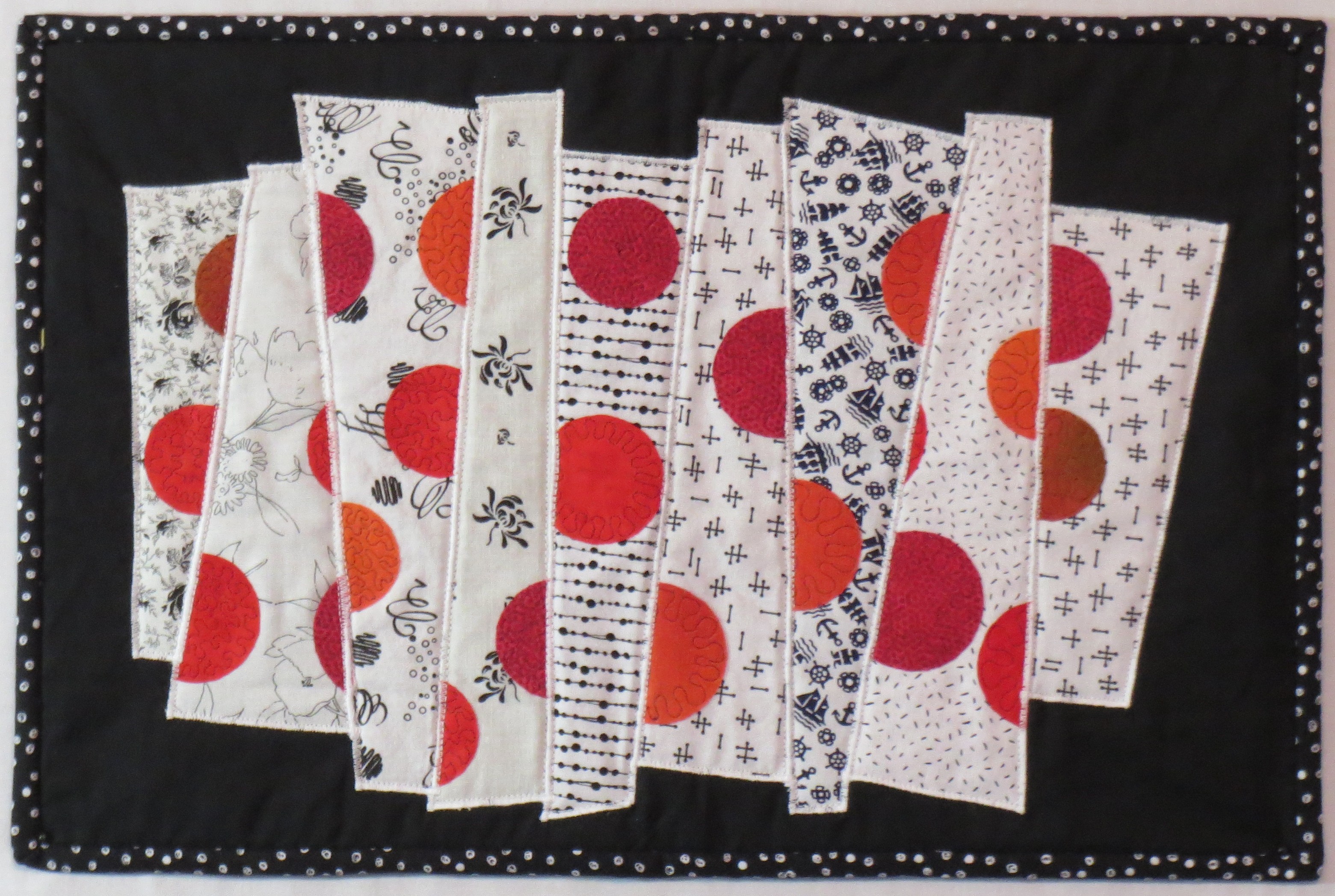
The quilt I “copied” is called Rainbows of Summer.  It uses a string piecing technique, making blocks using four to six fabric strips of varying widths.  I started with paper foundation rectangles that I cut 6 inches by 8 inches.  The paper rectangles were good for ensuring that my blocks were all the right size, but tearing out the paper afterward was tedious so I might try making the blocks using a template rather than a paper foundation the next time.

I spent a lot of  time sorting fabrics into colors of the rainbow and cutting strips.  My strips were all about 9-10 inches long and varied in width from 1 inch to 2 inches.  Some of them were narrower at one end that at the other; this adds some visual interest to the finished quilt.

Sewing the blocks is very straightforward once you have selected the colors for each horizontal row of the quilt.  I laid out piles of strips and picked out assorted fabrics as I went along, trying not to repeat the same fabric in one block and to vary the use of the fabric so that it did not always appear in the same position.  I  had 10-15 different fabrics for each color, so I had enough to choose from to create nice variety.  Once I had enough blocks of each color, I squared up all the blocks to 6 by 8 inches.  Then I assembled the quilt top one horizontal row at a time.

Here is the finished quilt top:

Rainbow scrap quilt based on Ann Brauer's "Rainbows of Summer", 64 in by 66 in

Rainbow scrap quilt based on Ann Brauer’s “Rainbows of Summer”, 64 in by 66 in

I really like the variety of fabrics and found this a great way to use up scraps.  Of course I had lots of scrap strips left over so I will have to dream up another project to use them!


Printable Fusible Web

I am working on another quilt with Kamon, or Japanese family crests.  These crest designs are quite intricate and are a real challenge to fusible webs.  They need a really good adhesive to keep the pieces in shape.

Recently I read about a fusible web I have not used before.  It is by June Tailor and is sold in 8 1/2 by 11 inch sheets and can be run through your inkjet printer.  The obvious advantage is that, for the right size applique pieces, you can copy or print the shapes right on to the paper back of the web — no tracing of the designs required!  The main disadvantage (compared to Steam-A-Seam, for example) is that the adhesive is not “sticky” before ironing.  So you can’t stick  down all the pieces, repositioning them as needed, and then permanently adhere them by pressing them with a hot iron.  I have found that it works better to place one or two pieces and press them with the iron, then go to the next couple of pieces, etc.

I had completed a couple of blocks using Steam A Seam and wasn’t satisfied with the results.  The particular fabrics I chose were regular cotton and tended to fray on the edges.  One way to solve this problem is to use batiks, which fray much less than regular cottons.  But since I am experimenting with these block designs, I just grabbed fabrics from my scrap bins and some of them were not batiks.

Here is the result of the fusing with Steam A Seam.  You can see the frayed edges.

frayed edges show with Steam A Seam fusible.

frayed edges show with Steam A Seam fusible.


And here is the same block fused with the June Tailor product.  The edges are much cleaner.

much less fraying with the June Tailor fusible web

much less fraying with the June Tailor fusible web

For these intricate designs,  I will be using the June Tailor fusible web in the future.  It is more expensive than other fusibles, so I will be ordering it from a wholesale source to get the price down.  But it can be purchased easily either at your local shops or through Amazon at the following link:  June Tailor 8-1/2-Inch by 11-Inch Ink Jet Printable Fusible Web, 6-Pack  .

Creating dimension on applique with colored pencils

I recently picked up a book “Twelve by Twelve: The International Art Quilt Challenge”  about a two year long  challenge conducted by twelve art quilters. (Buy it here: Twelve by Twelve: The International Art Quilt Challenge  ).   The entire challenge was conducted online.  A theme was selected by one member, and all the members had two months to produce a 12 inch by 12 inch quilt based on that theme.  After the challenge was completed, the members published this book.  All the members discuss their thoughts about the challenge and how they arrived at their particular quilt design.  It is very interesting reading, and very thought provoking if you want to be an art quilter.

A number of interesting techniques are described in the book.  One I found intriguing — and compatible with some of the things I have been doing this year – was a technique described by Terry Grant.  She used pastel pencils to add shading to commercial fabrics to get a more realistic result.  I just played around with this idea today and can see how it works.  According to Terry, after you are satisfied with the result, the shading is made permanent by painting over it with a dilute solution of acrylic textile medium and water.  I haven’t tried that part yet, but here is the result from spending 30 minutes or so adding the shading with  white, navy blue, and black pencils .

fused applique pieces have a flat appearance
dimensionality added with pencil shading

dimensionality added with pencil shading

Interesting!  This is much like what I was doing last spring with my sliced circle pieces with crayons and Shiva Paintstiks.  At that time I settled on a  white Paintstik to get the best white highlight on the spheres.  The pencil result here is quite good and much faster, if it will truly be permanent after covering with the textile medium.

Book Review: “The Creative Habit: Learn it and use it for life” by Twyla Tharp.

This book was recommended by Elizabeth Barton in the class I took from her this spring through the Academy of Quilting. I have been slowly reading it ever since. I am still not finished, but I have read enough to highly recommend it.

This book is written in a very conversational, down-to-earth style.  All the concepts are illustrated with real-life examples, and numerous exercises are included to help the reader understand their own creative motivations and how to get started and keep going through the creative process.  The author, who is a dance choreographer, talks about what it is like to face a looming deadline for a performance, knowing that somehow the creative ideas will come and that she will be able to create a dance. She has given a lot of thought to the creative process, and developed many practical tools and habits that facilitate creative development. I particularly like the discussion about “scratching for ideas”.

What I have learned from this book is that understanding the creative process and having the “tools” to use it can make the difference between a craftperson who copies the work of others and an artist who creates genuinely original work. And it helps to understand that all artists, no matter the medium, go through the same intimidating process of coming up with ideas and turning them into finished work.  Importantly, there is plenty of emphasis on the hard work and investment of both time and emotional energy that it takes to get from that vague beginning of an idea to a finished piec of art.

If you have the goal of becoming a creator of truly original art quilts – and it is perfectly OK if you don’t – this book is an excellent resource.

You definitely won’t find this book at your local quilt shop, so here is a link where the book can be purchased at Amazon: The Creative Habit: Learn It and Use It for Life

Zentangle drawing and quilting

In my gallery are photos of several quilts I have made from Zentangle drawings.  Zentangle (www.zentangle.com) is a recently invented art form that is a beautiful kind of structured doodling.  In its simplest form, practicing zentangle requires nothing more than small squares of good drawing paper (stiff paper is best), a few good drawing pens, and a couple of soft pencils.   Pigma pens are recommended but you can use many others such  as ultra fine point Sharpie if that is what you have.  Just don’t try to use a ball point pen.

These minimal supplies make Zentangle the ultimate portable art form.  Put the supplies in an envelope, tuck them in your purse, and you can amuse yourself easily the next time you are stuck waiting for something or someone.  The process of doing the drawings is very meditative, so it is a great way to distract yourself when life throws you one of those inevitable challenges that you must slog through.

Here are photos of some of my  zentangle drawings.  They look very complicated, but they are produced step by step in such an organized way that anyone can achieve success quickly.  A lot of zentangle drawings are completely abstract, and that is what I did at first.  I would show you those first drawings but I can’t seem to find them right now!  For a couple of the ones below, I was experimenting with some more representational elements.

Zentangle Butterfly

Zentangle Butterfly

Zentangle Abstract

Zentangle Abstract

Zentangle ribbon burst

Zentangle ribbon burst  wouldn’t this make a cool quilt?

Zentangle trees

Zentangle trees

There are many Certified Zentangle teachers available to teach you this art (list at http://www.zentangle.com), but there are also  books available.  As a first book, I recommend “Zentangle Basics” by Suzanne McNeill. Suzanne has written many books about Zentangle; you can find them at your local art supply store or on Amazon.  I will put direct links to some of the books at Amazon at the end of this posting.

Once a zentangle drawing is made, it can be turned into a quilt.  A great book  on this is “Zen Quilting Workbook” by Pat Ferguson.  Suzanne McNeil has also a good book called “Inspired by Zentangle – Fabric Arts Quilting Embroidery”.  The two photos below are quilts I made from designs in “Zen Quilting Workbook”.

Zentangle quilt pattern  from Zen Quilting book

Zentangle quilt pattern from Zen Quilting book

Colored Zentangle quilt, pattern from Zen Quilting

Colored Zentangle quilt, pattern from Zen Quilting

All of these quilts are done by enlarging the design as desired, tracing the design on the fabric with water soluble or iron-away pen, creating a quilt sandwich,  and stitching the pattern outlines by free motion.  The  fine detail lines and solid black areas are filled in with ink.  The softer gray shading is done with pencil.  Colors can be applied in many ways with paints or inks. Although the basic Zentangle form uses just black, white, and gray,  many artists have extended it into various colors.  And some lovely drawings and quilts have been done that are white or silver patterns on a black or other dark background.

One day I did an original  graphic abstract zentangle design and used it for the pocket on a tote bag:

Zentangle embellished tote bag

Zentangle embellished tote bag

Check out my quilt, “Quiltangled Portland” in my gallery. There is also a photo of another quilt there  from one of my original abstract zentangles.  And here are the links to the Zentangle books I recommend above:

Zentangle Basics by Suzanne McNeil  — well, I don’t understand why, but Amazon won’t let me link to this book.  They sell the book, I just can’t make a link to it.  You can go to Amazon and type in the title and you will be able to order it.

Zen Quilting by Pat Ferguson:  Zen Quilting (DO #5375)

Inspired by Zentangle: Fabric Arts Quilting Embroidery by Suzanne McNeil:  #5366 Zentangle Fabric Arts

Happy tangling!


Completion of “Working In Series” quilts

I have completed six quilts in my Working In Series class, and will show all of them in this post.  The class was very challenging and I recommend it highly for any of you interested in producing more art quilts.  Again, the class is taught by Elizabeth Barton through the Academy of Quilting (www.academyofquilting.com) .

Here are the quilts, in the order I completed them.

1.  Blue spheres.  The background is hand painted.  A variety of white on white fabrics were used for the strips.  The spheres started with circles in several blue and green fabrics.  The shading was produced with a white Paintstik (see earlier post for details).

Blue Spheres

Blue Spheres

2. Purple circles.  Deep purple background fabric, lavender strips (some hand painted), and a variety of purple circles.

Purple on Lavender

Purple on Lavender

3. Purple circles on yellow strips.  Half the yellow strips were painted with a diluted brown paint to darken them slightly to add more depth.  The background is dark purple.  A variety of purple and blue fabrics were used for the circles.

Purple on Yellow Strips

Purple on Yellow Strips

4. Black and white and red.  Black background fabric,  A variety of black and white prints for the strips.  Red-orange circles.

BLack and white strips with orange red circles

BLack and white strips with orange red circles

5. Blue, tan, and red.  Here circles were cut out of the original circles.  I like this idea and want to explore it further.

Blue tan and red

Blue tan and red

6. Cream, Blue gray and brown.  The blue gray strip fabric was a handpainted piece left over from a previous fabric painting class taught by Michelle Scott.


Cream BlueGray and Brown

Cream BlueGray and Brown


I can think of many ways to explore this theme further, and look forward to doing so in the future.

Evolving My “Sliced Circles” Designs

Continuing on with my progress in the “Working In Series” class.   I did numerous sketches of fractured circles, split circles, etc.  I went looking for photographs of circular things, and walked around with my camera taking pictures of circular things.  I printed out some shaded circles from my drawing program.  I made some very uninspired sketches and mockups.  A few seemed promising, but didn’t get me excited.

Finally, I found some photos of some interesting old circular gears by searching online.  I printed out the photos and sliced them up, reassembling them into a collage of sorts.  I liked the feel of it and decided to pursue the idea.  I am not showing my cut and paste mockup here because the original photos are copyright protected.  But I will show you where I went from that mockup.

Here is my first mockup, using a watercolor painted background and some shaded spheres printed out from my drawing program:

Sliced blue spheres on white strips

Sliced blue spheres on white strips

You will see the quilt I made from this mockup in a later posting.

I began working on this quilt (I did an earlier post on how I used paint to shade the spheres) but at the same time I was working on variations of the design.  Following are a few sketches that I decided show promise.  Some of them ended up as quilts, and others are waiting to be developed further.

Fractured Circle Study 3

Fractured Circle Study 3

Fractured circle study 4

Fractured circle study 4


Fractured circle study 10

Fractured circle study 10

After these sketches I did some of the designs with turned applique and some with fused raw edge applique.  Stay tuned for the finished quilts!

Using Watercolor Paints for Quilt Design and Creating a Mosaic Quilt

I have completed my class, “Working In Series” taught by Elizabeth Barton.  It was really interesting to watch the development of quilt series by all the students.  As in most online classes, only a few students actually carried through to complete a series.  In some instances, this was because the students had selected a  complex topic.  Those of us who chose simpler abstract shapes — or a small flower, in one instance – were able to finish the process. Students who chose topics such as a series of landscape quilts or quilts based on buildings had much more work to do to develop their series and were not able to finish within the time frame of the class.

I posted earlier about using watercolor pencils for quilt design.  Following that exercise, I purchased a small set of tubes of watercolor paint and painted some simple large flowers.  We were instructed to use black, white, and gray to make a value study and then paint others in color.  I am only going to present the value study here.  As you will see, I have no skill at painting!

Here is my black and white value study:

Watercolor value study

Watercolor value study

Using this value study, I drew a grid on top of the watercolor painting and assigned a “value” to each square.  The photo below shows a closeup of the grid and numbers.

Value grid with numbers

Value grid with numbers


I ended up with seven different value numbers.  I grabbed some black and white prints from my stash with a range of values from light to dark, and selected seven of the fabrics.  I cut a rectangle from each fabric and put a fusible web on the back.  I then cut one inch squares from each fused fabric, keeping the each fabric in a separate numbered pile.    A grid was drawn on a piece of white fabric (one inch squares) with an iron-away marker (Frixion pen). The squares of black and white fabrics were placed on the piece of white fabric, matching the numbered squares in the original design.  Once all the fabric squares were in position, I ironed the pieces down. The following photo shows the result.

Mosaic quilt from black and white value study

Mosaic quilt from black and white value study

I doubt I will ever turn this into a quilt, but the process is used by some quilters to make  spectacular quilts from photographs  (such as very large portraits) where the color and value of each small area of a photograph is matched.  Once the fabrics are selected, the process is very methodical.

Designing Quilts with Watercolor Pencils

I am currently taking an online art quilt design class, “Working In Series”, taught by Elizabeth Barton through the Academy of Quilting.  It is a very interesting class.  As my class project I am working on quilts with the theme of circles.  I have chosen to concentrate on the idea of fractured circles using gradated color schemes.

One of the teacher’s suggestions was to use watercolors to come up with quilt designs and work out color schemes.  I don’t own any watercolor paints at the moment, but I did find some watercolor pencils in my art supplies, so I decided to work with them.  This is not going to teach me one of the main lessons the teacher intended — which is to work fairly fast and loose.  I think I will purchase a small watercolor paint set next time I am off the island so I can learn the lesson she intended (since working fast and loose is definitely not my style!), but for now I am working with my watercolor pencils.

You can find some excellent videos online describing how to use watercolor pencils, so I won’t go into too much detail here.  But here are my tools and the results I have developed for my “fractured circles” theme.

First, the tools.  You need some watercolor pencils – I only own a set of 12, so my color palette is quite limited.  Next you need heavy drawing paper (watercolor paper if you have it), some water, clean paper towels for blotting up the water, and a small paint brush or two.  A good art eraser and a pencil sharpener would also be helpful.  In addition to the small brushes, I added a brush with a built in water reservoir that I purchased when I got the watercolor pencils.  It is really cool  — you just squeeze the tube and water comes out in the brush.  Good for working in large areas, but not as precise as a brush that you dip in water.  Here is a photo of the pencils and brushes:

Watercolor pencils and brushes

Watercolor pencils and brushes

And here are a few of my results.   I did lots of them, so I am only showing you the ones I like best.  I like the ability to explore color and design options quickly without wasting any fabric.  The color really helps me evaluate the designs.

Watercolor study 2

Watercolor study 2

Watercolor study 3

Watercolor study 3

Watercolor study 5

Watercolor study 5

Watercolor study 6

Watercolor study 6

Watercolor study 7

Watercolor study 7

As you can see I had limited color choices due to my set of only 12 pencils.  If I learn anything more from the actual watercolor paints (especially if it actually succeeds in loosening up my style), I will report back later.

Coloring fabric with melted crayons

In the online class I am taking at the Academy of Quilting, I was puzzling over how to shade some circles to make them look like spheres.  One of my fellow students provided a link to a video and suggested I try the “melted crayon” technique.  I watched the video and got interested enough to try it.  I am going to put some of my results here.  At the end of this post I will provide links to the video and to a blog post that provides more details.

This technique doesn’t require any expensive investment.  You probably already own most of what you need.  I plan to use this technique for art quilts; the resulting color seems to be reasonably permanent but I would run a sample piece through the washer and dryer several times before I used it on a regular quilt.

Here is what you need:  your fabric (probably a high thread count white or very light fabric, such as Pimatex) and whatever fusible web you normally use; an applique pressing sheet – one intended for use when you are building up a multiple-piece fusible applique (the fusible is  ironed down to this sheet, but can then be peeled up and ironed permanently onto fabric); a box of crayons; some paper napkins; a roll of paper towels for cleanup; and a hot dry iron.  If you are not familiar with applique pressing sheets, you may find one at your local quilt or craft store or here is a link where you can buy one on Amazon: Bear Thread Applique Pressing Sheet .  This is a link to the smaller, less expensive one (About $12).  There is also a bigger one for about twice as much, and there are other brands as well.  This just happens to be the brand I have and it works well for me.

Here is the process, briefly.  You draw whatever shape you intend to use for the applique on the paper side of the fusible web.  Then apply the fusible web to the wrong side of your fabric following the manufacturer’s directions.  Cut out the applique shape.  Press the applique shape onto the applique pressing sheet.  You then use the iron to get the applique shape AND the applique pressing sheet very hot.  You grab a crayon and rub it on the hot pressing sheet.  This makes a little “puddle” of color.  You then pick up the color with the tip of a folded paper napkin and transfer it to your applique shape.  Like magic, you have “painted” your applique.  I am not going to provide more detail about the process because the links I am providing below give you all that.

Here are a couple of photos of the spheres I painted using this technique.

Spheres colored with melted crayons - first try

Spheres colored with melted crayons – first try

And I tried again the next day and found I was more comfortable with the technique, and was able to do it more quickly and got slightly better results:

Spheres colored with melted crayons - second try

Spheres colored with melted crayons – second try

After completing the coloring, I placed a paper towel over top of the shapes and ironed them to remove any residual color.  Then I washed them in hot soapy water; none of the color came out.  As always, your results may be different so be sure to run your own test and make sure this process is suitable for your particular project.

I also tried a couple of other techniques for coloring the spheres.  When I was colored white fabric as shown above, I got the best results with the crayon technique.  For colored or dark fabrics, I got better results using Shiva Paintstiks (opaque solid oil paints).

I tried some liquid fabric paints also but didn’t get very good results.  I suspect that has more to do with my lack of skill than with the products.

I recently did a project using the Shiva Paintstiks and will be putting up a post about that project next week.  Lots of details and step by step photos in that post, so I am not going to say much else about it here.

The melted crayon technique has some nice advantages.  You can have a full range of colors for the modest price of a big box of crayons.  A small project can be completed quickly with little cleanup since the color is applied with paper – so no brushes to clean.    A second or third color can be layered on top of the first one immediately.  The color is dry right away – no waiting until the next day or several days for the paint to dry.

Here is the link to the video for any of you who are interested:  https://www.youtube.com/watch?v=VJN41E2Akto  .

My friend Charlie, who also took the class, provided a link to a blog post by another quilter, with great photos and useful information about the technique.  I have tried to put the link here, but for unknown reasons it won’t work.  I don’t know why I can get to the link from my email or from a google search, but not when I post it here.  So I can only suggest you also do a google search for “Quilt Whimsy blogspot melted crayons” and it should come right up.  I found it helpful to read this blog post after watching the video; it sort of reinforced the details and I could study the photos more carefully to make sure I understood the process.  The video and blog show using this technique on an apple and a leaf, and used multiple colors to get a very realistic look.  Terrie Kygar, who did the video, also has written a book about the technique, available through Amazon here: Creative Quilts from Your Crayon Box: Melt-n-Blend Meets Fusible Applique