Category Archives: Contemporary Quilts

Mariner’s Alphabet Pattern published

I am pleased to announce that I have published the pattern for my Mariner’s Alphabet quilt. This is a really fun quilt to make. The blocks are simple foundation (paper) piecing. The link to Pattern Spot where it can be purchased is on the Pattern page of this blog.

Mariners Alphabet banner

Mariner’s Alphabet 26 inches by 62 inches

Points of Elegance pattern now available

I have just published the pattern for my fireplace mantle runner and the matching table runner and placemat. The mantle runner is shown below; photos of the table runner and placemat, plus the link to Pattern Spot where you can buy the patterns are shown on my Pattern page.

fireplace mantle runner

Points of Elegance Fireplace Mantle Runner

Garden Tiles Pattern now available

Garden tiles quilt in pinks and blues

My super simple but dramatic Garden Tiles quilt, made from my guild’s charity quilt fabric stash

I am pleased to announce that I have my first quilt pattern available for download at Pattern Spot. The link to get to my pattern shop there is on my Pattern Page (see buttons above the banner photo on this page).  On that page I also show another version of the quilt.

I am offering the pattern for free to  the first two quilters who volunteer to test it in the next couple of months and tell me about any problems they have with the pattern.  Also, I am not very excited about the name.  I will also give a free pattern to the person who comes up with a name I like better than Garden Tiles.  For either of these offers, just email me at shirley@mysterybayquiltdesign.com .

If you read my earlier postings, you saw some earlier versions of this quilt under the title “Quilt Pattern Tune-up”.  I plan to complete the Garden Windows version of this quilt as a pattern also.

Use of “negative space” in quilts

I am taking a class right now called “Art for Quilters”, taught by Marilyn Belford ( http://www.marilynbelford.com ) at Quilt University ( http://www.quiltuniversity.com ). One of the first homework assignments is in the use of “negative space” – that is, the space outside the design elements where there is no piecing or applique. Negative space is also one of the common elements of the Modern Quilting movement so popular currently. Although they don’t name it, traditional quilters often use negative space in the form of alternating plain blocks, plain setting triangles, or sashing. Negative space gives the eye a place to “rest” as it moves around the quilt. It helps emphasize the importance of the positive elements of the quilt.

I am pleased with the impact that can be achieved with simple geometric shapes and using a lot of negative space. Here are some examples from my class homework.

First, I cut a rough circle was out of a lavender fabric, cut it into irregular pieces, and then scattered them about on a purple background:

Cut up circle with negative space

Circle cut up for negative space exercise

Then, I cut a light grey square into strips and placed them on a very dark grey background:

Square cut in strips showing negative space

Square cut in strips for negative space exercise

I cut a green rectangle into smaller rectangles and other shapes and placed them on a blue print background:

Rectangle cut up for negative space exercise

Rectangle cut up for negative space exercise – I had to do some additional cutting to make the pieces fit on this one

And I cut up several black triangles and placed them on a marbled grey/mauve background:

Cut up triangles for negative space exercise

Cut up triangles for negative space exercise – this one looks sort of Native American to me

Aren’t these interesting? With some appropriate borders and free motion quilting in the negative space, I think these are going to make dramatic little quilts. I will report more progress as I continue.

I am very pleased with this teacher and the class materials so far. Marilyn Belford also teaches a class called Realistic Fabric Portraits at QU that starts June 28. She has a book available on the same topic Portraits For Fabric Lovers  (if you click on the name here it will take you to Amazon to buy the book, so don’t click unless you want to do that).

I was saddened to find out that Quilt University – where I have taken many classes and learned so much – is shutting down at the end of this calendar year. It was founded by Carol Miller who recently died after a short illness. Her husband Roger, who was always the technical guy behind the scenes, has decided to have a graceful shutdown and allow all us QU addicts to take the classes we have been putting off. I am going to be very busy for the next few months trying to do just that.

Quilt Museum links

I just received an email from our guild webmistress with a link to the Victoria and Albert Museum (in London, England) quilting section. They have some excellent material and it is well worth taking a look:

http://www.vam.ac.uk/page/q/quilts-patchwork-and-quilting/

And don’t forget the excellent resources at the International Quilt Study Center & Museum at Lincoln, Nebraska:

http://www.quiltstudy.org/

And the National Quilt Museum in Paducah, Kentucky

http://www.quiltmuseum.org/

All these places would be wonderful to visit. Fortunately they have some excellent resources online, so we can benefit from their work even if we can’t go visit.

A quilt pattern tuneup – part 2


Based on some excellent comments from Charlie, I have gone back to Electric Quilt and come up with a couple of revised designs. The first just changes the widths of the sashing strips so they are all a consistent one inch finished. I think Charlie is right, it is better with the consistent width. The second, shown below, follows Charlie’s suggestion of making all the sashing strips one color. This quilt would actually be easier to make because the sashing would not have to be added to each block individually, and it takes fewer fabrics. The first version has a little more “punch” and the second is softer and emphasizes the print fabric more.  I like them both.

Garden windows quilt with purple and blue sashing

   Garden windows with all sashing the same width

Garden Windows with blue sashing only

Garden Windows with blue sashing only


A quilt pattern tuneup part 1

I designed a quilt pattern a few years ago for a local shop, using a specific fabric line (Kumiko Sudo was the designer). The line included one fabric with a very large pattern. So the resulting quilt design, which I called Garden Windows, looked like this mocked up in Electric Quilt:

Garden windows quilt in red

Garden Windows in red from Kumiko Sudo fabric line

And here is another version, using a smaller scale focal print:

Garden windows purple and green quilt

Garden windows quilt in purple and green

I hadn’t actually made this pattern up in fabric, since I wasn’t getting paid for the design. I like the pattern enough to rework it, so this is my first report on the re working. I am labeling this post part 1 because I am not totally happy with the quilt yet, so I expect to change it a little.

I found another fabric with a large design at my local quilt shop, and selected several fabrics to accompany it. The fabrics are shown here.

Focus print and companion fabricss

Initial fabric choices for the Garden Window qult

The red and blue solids bring out the flower colors in the focal print. I hadn’t decided on the fabric for the borders and setting triangles at this point, but thought I would try to find a blue and black print. I couldn’t find one that worked, so I had to go another direction. I went back to the shop and bought a coordinating leaf print in the same line as the focal print. The completed quilt top is shown below.

Garden Windows quilt with red and blue flowers

Garden Windows red and blue flowers version

In retrospect, I think the solid blue is too bright, and I should have used a darker blue or switched to the red for the block sashing rectangles around the white/green blocks. Fussy cutting the large blocks consumed an incredible amount of fabric – not good in this day of rising fabric prices. I also think the blue sashing strips are too narrow. I will go back to Electric Quilt and mock up a new version of the pattern with wider strips — if that will work geometrically. Don’t know yet. Stand by for further developments…

Quilt Show in Port Townsend

Yesterday my friend Charlie Petersen and I hung more than 35 of our quilts at the Uptown Dental Clinic in Port Townsend, Washington. The quilts will be on exhibit from April 15 to July 11 this year. If you are in the area, do come to the show.  Details are under the Calendar page.

Here are three photos after we hung the show. The lighting isn’t quite right yet — the Clinic staff will adjust the lighting next week, now that the quilts are hung. But I took these photos today as we finished putting up the quilts.

The waiting room seating area

Uptown Dental reception area aa and trim Apr 12 2013

The main hallway – quilts from one end to the other.  The Clinic staff loves all the color quilts add to their environment.  We love them for giving us the opportunity to take our quilts out and show them off!

Uptown Dental main hallway aa and trim Apr 12 2013

And a shot of one area in the hallway.  Charlie has been exploring modern quilting lately; the one on the right is one she finished a couple of months ago.

Uptown Dental main hallway colorful quilts aa and trim Apr 12 2013

© 2013 by Shirley Sandoz and Mystery Bay Quilt Design.  All rights reserved.

Making your quilt pictures better

As I have been building this blog, I used many photographs of my quilts. These photographs had been taken at different times with different lighting. The light in my quilting studio is pretty good, but is only really good for photography on sunny days. So there was a lot of variation in the quality of my photographs, and some have much better color accuracy than others.
For a good article about quilt photography, go to www.adventurequilter.com/e-Learning/Articles/Photography_Quilts.html . Before you worry about the details I am discussing here, you need to do the best you can to get a quality photograph. I am going to talk about what to do with that photograph, once you have it, to get the nicest picture to meet your needs.
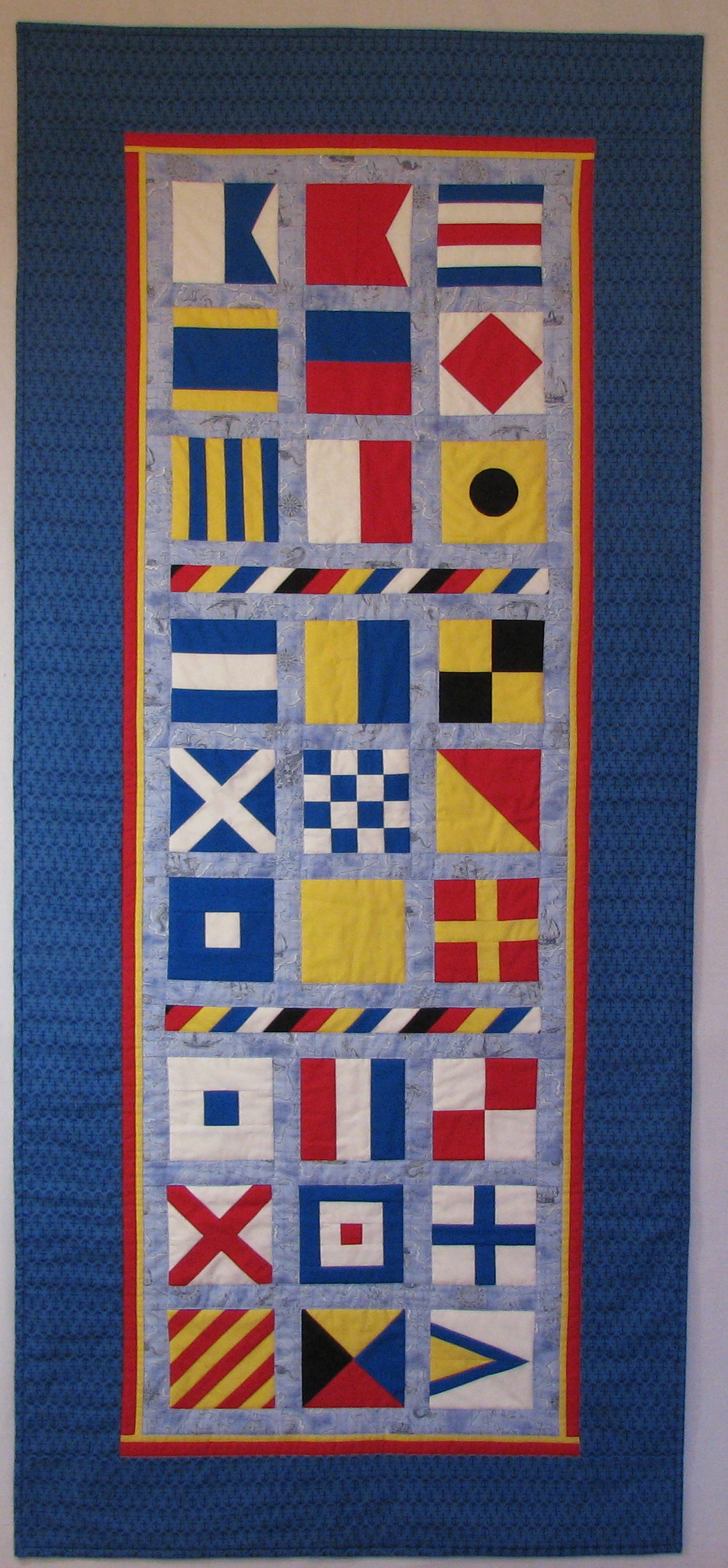
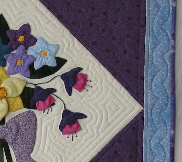
When you are entering a quilt in a juried competition, the entry requirements will state that you must submit photos that show the entire quilt including the edges, and then one or more closeup photos to show detail.
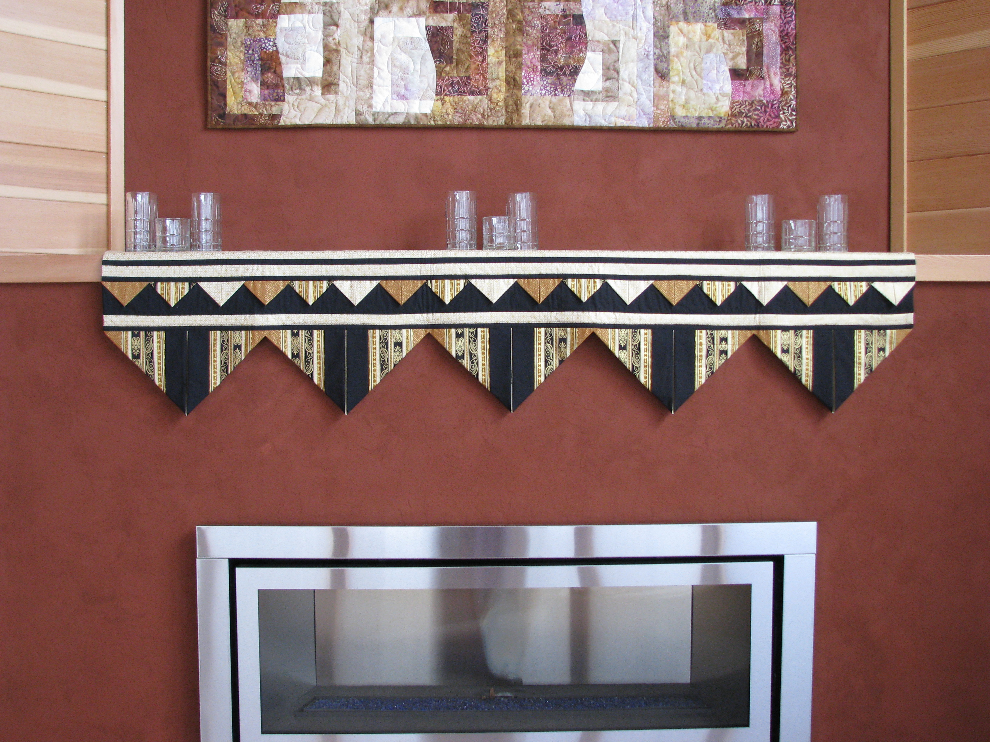
For use other than competition, it is often better to crop out the edges of your quilt to avoid the distraction of the background. You will have to use your own judgment to decide whether or not to crop.
My focus here is on the use of two features of your photo editing software – the ability to trim or crop the photo, and the ability to adjust the exposure. If you have a Windows based computer, you probably have software called Windows Photo Gallery that can do these two things.  If you have a Mac you will have something similar.  Or you may have software that came with your digital camera. Adobe Photoshop or Photoshop Elements can do this also, as can most similar packages. My point is, your computer can probably do this even if you don’t know it can!
First, open up a photo in whatever software you are using. Look for a menu selection that says “Fix” or “Edit”. Under that menu, there will be a choice to crop or trim the photo. The other option – auto correct or autoexposure – is probably also there. And you may have many other choices. But I am only going to show examples using these two features.  You will have to learn how to use the trimming or cropping feature of your software.  It’s usually pretty easy and you will probably just have to draw a box around the parts of the photo you want to keep, push the “trim” or “crop” button, and then approve the result.  The autocorrection or autoexposure is even easier; you just push the button and watch what happens.
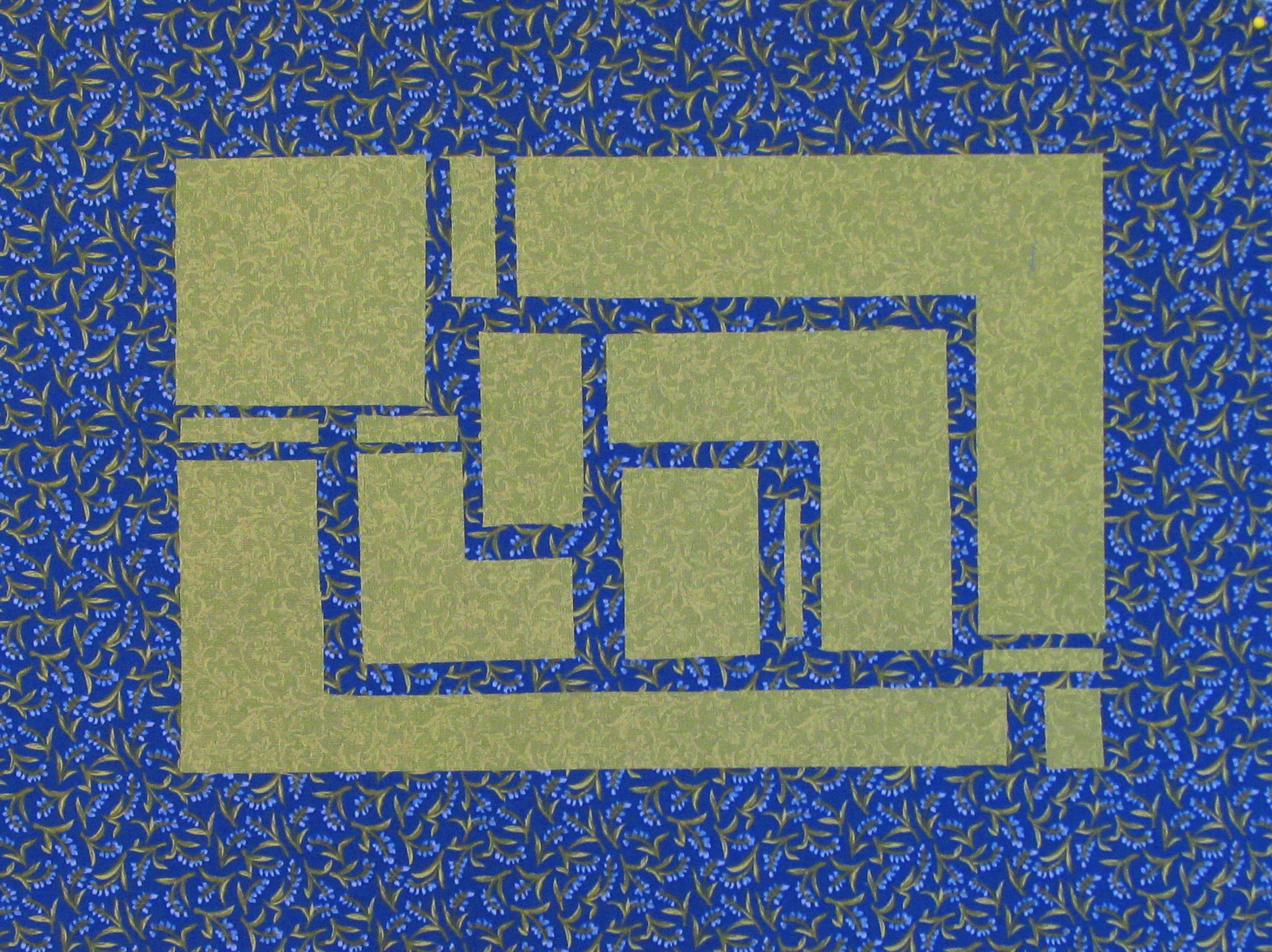
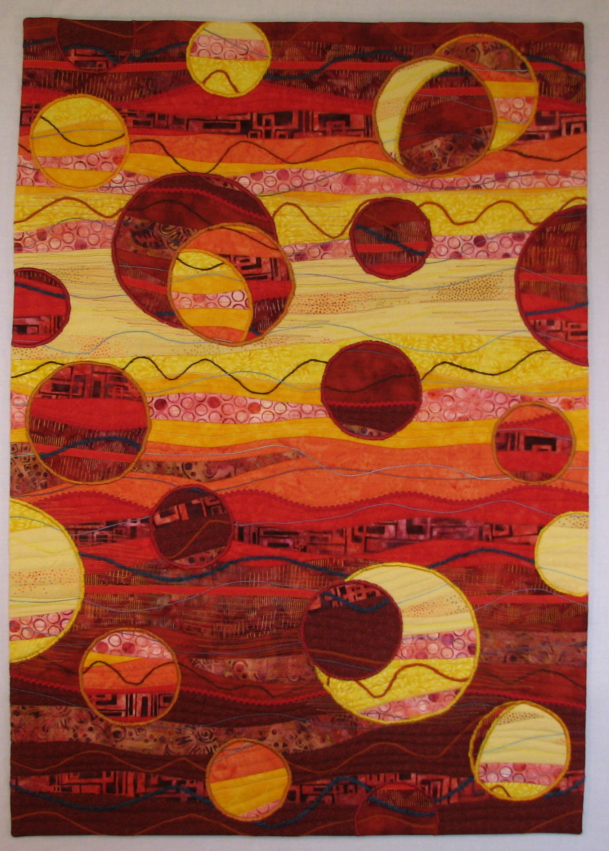
First, my quilt “Fireballs” on the left as I photographed it on my design wall.  The photo on the right shows the photo cropped as it would be for a competition, with the edges showing.

IMG_4330    Sandoz Fireballs 2 Apr 9 2013

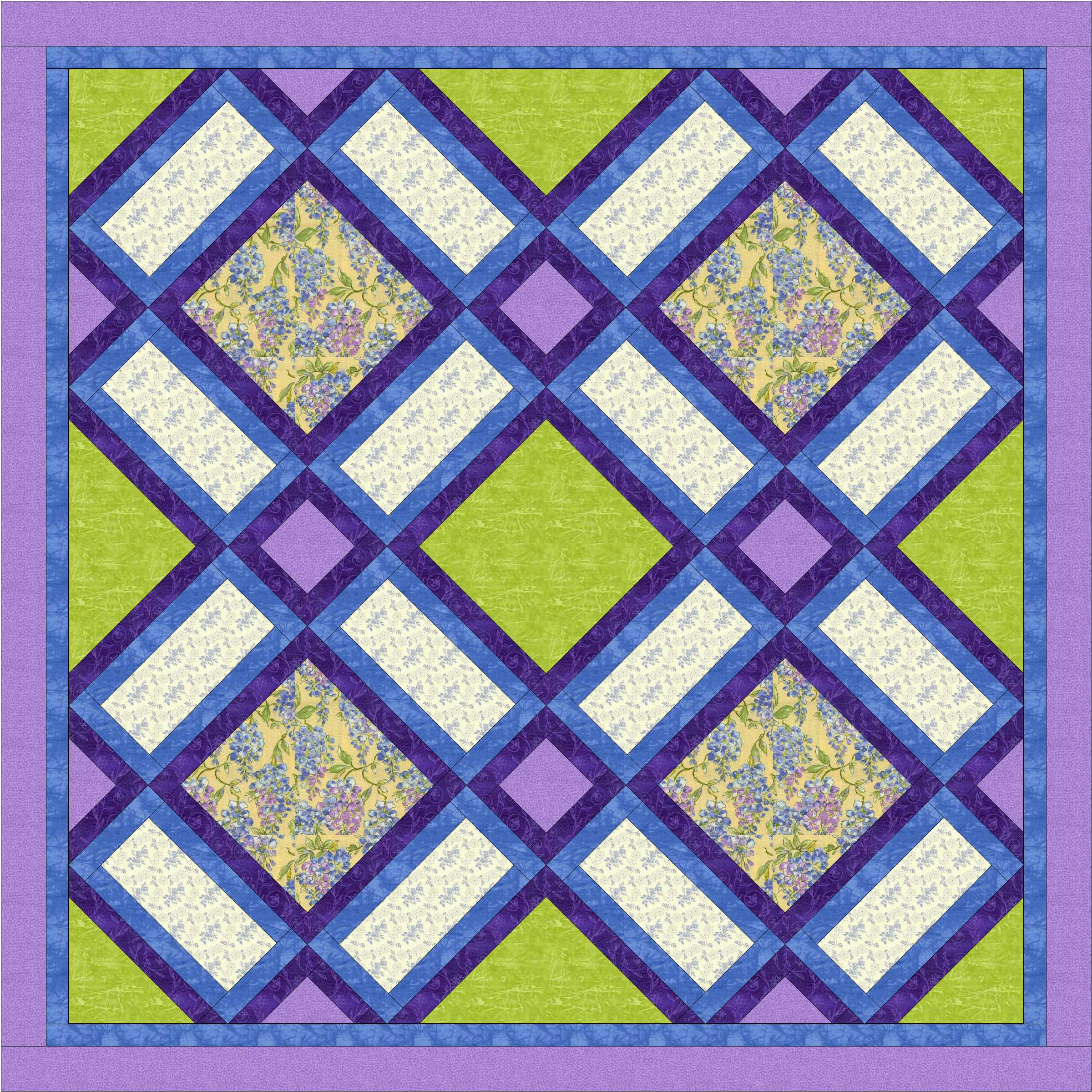
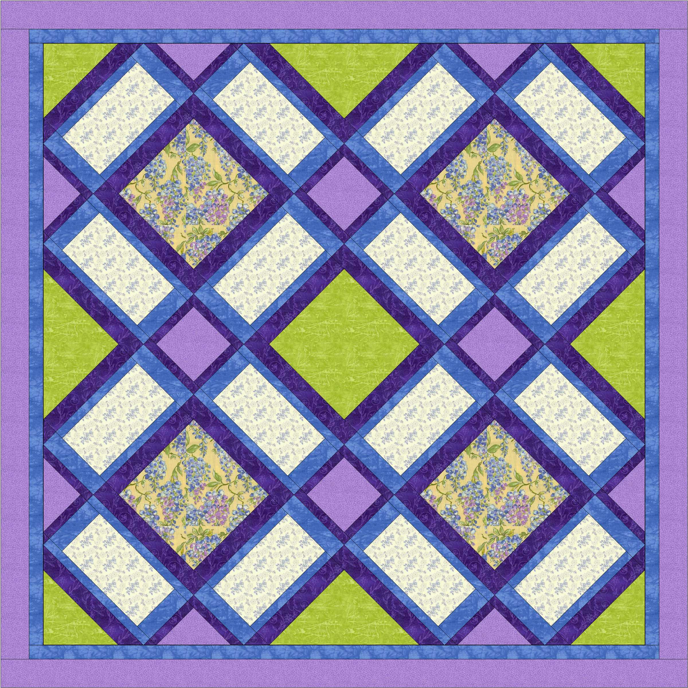
And below on the left as cropped for use here in my gallery. See how much nicer it is without the distracting background?  And below on the right is the last magic,  when I used the auto exposure correction feature. I selected the autocorrect (or autoexposure, whatever your software calls it) and basically just pushed the button. The amount of improvement you get varies with each photograph. Sometimes it is an astounding improvement, sometimes it is subtle, and occasionally the auto correction makes the photo worse. When that happens, just cancel out and go back to the original image.

Sandoz Fireballs 2 trimmed for blog but not corrected Apr 9 2013                 Fireballs aa and trim Apr 7 2013

Now here is what happened with one of my little Quiltangle pieces when I applied the autocorrection. On the left below you see the original photo.  On the right is the photo with auto correction.

Zentangle x Feb 24 2013    Zentangle 1 aa  Feb 24 2013

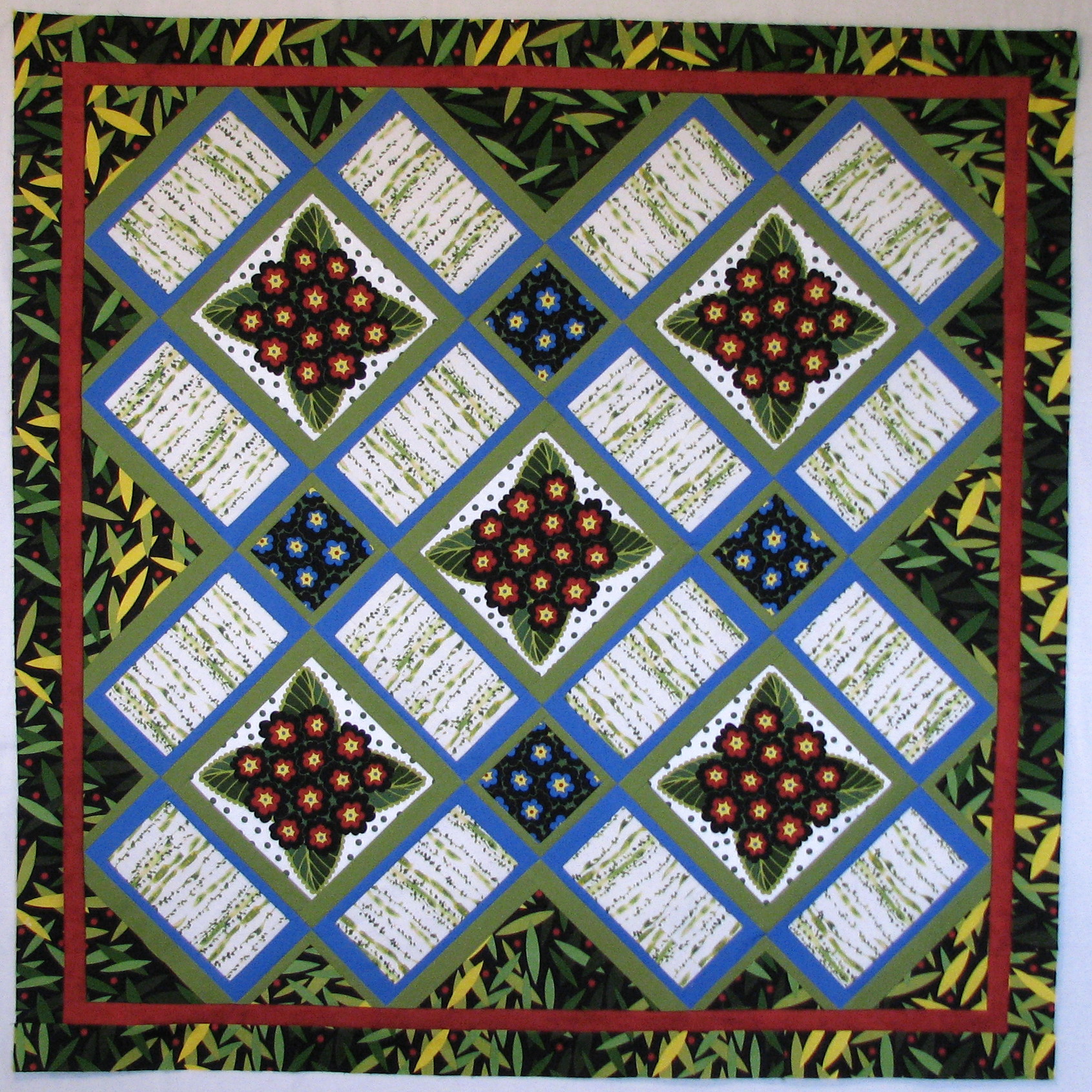
Now it is possible that I could have fixed this in the original image if I had adjusted the white balance on my camera.  So far I haven’t figured out how to make the white balance feature on my camera work, so this is the best I can do right now.

Here’s another example.  Look at the difference in the photo I use for my Quilting with a Walking Foot class.   On the left is the original photo.  On the right is after a little bit of cropping and the auto exposure correction.

3D flowers closeup      3D flowers closeup aa and trim

So try these two features of your software package next time you are using a quilt photo.  I think you will be pleasantly surprised!

© 2013 by Shirley Sandoz and Mystery Bay Quilt Design.  All rights reserved.